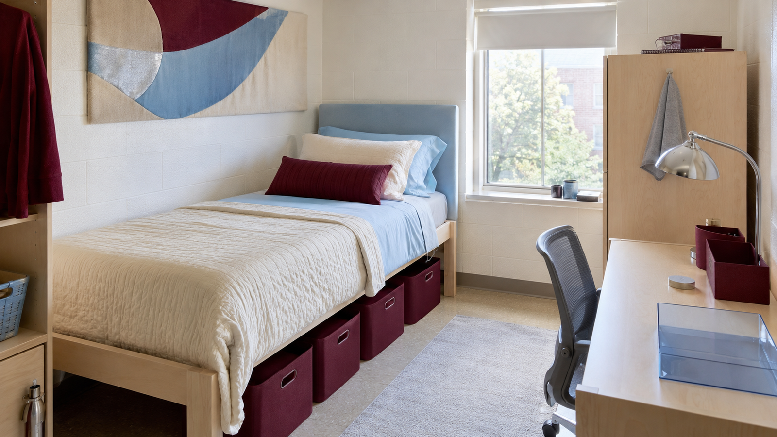
Dorm rooms come with plenty of fixed finishes: beige walls, light laminate furniture, gray flooring, and overhead lights that rarely flatter anything. The best dorm room color schemes work with those limits instead of pretending they aren’t there.
Each palette below uses bedding as the largest controllable color block, then adds smaller repeats through storage, lighting, removable wall decor, and desk accessories. The result feels coordinated and current without repainting the room, replacing college-issued furniture, or covering every surface with decorations.
1. Cobalt, Cherry Red, and Soft White
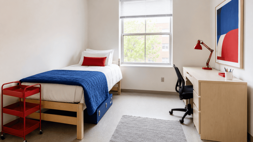
Let soft white cover about 60% of the room through sheets, curtains, and open wall space. Use cobalt blue for roughly 25%, including a washable quilt or compact rug, and reserve cherry red for a lamp, storage crate, and one graphic print.
Warm soft white is more forgiving than optic white beneath harsh dorm LEDs. The pale background also gives two saturated colors enough breathing room. Choose solid textiles instead of busy red-and-blue patterns, which can make a twin XL bed look smaller and harder to coordinate.
2. Butter Yellow, Burgundy, and Chrome
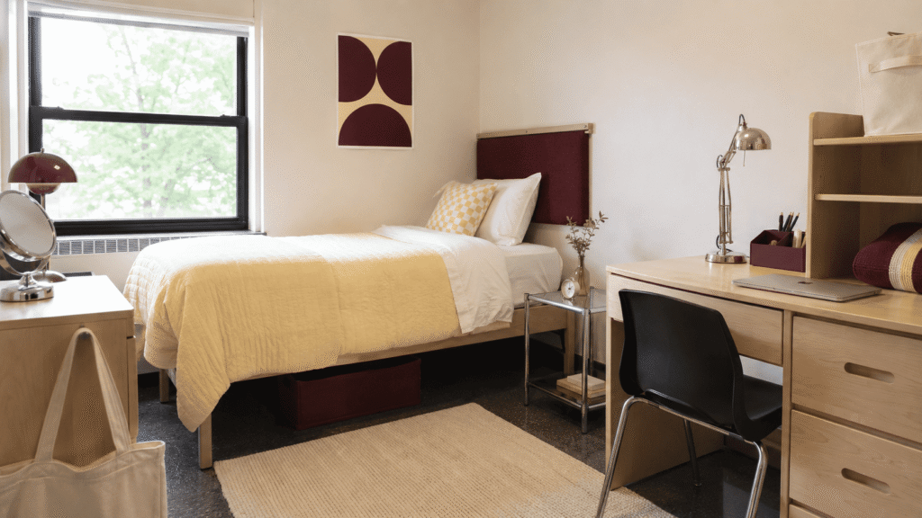
Butter yellow reflects daylight without becoming as sharp as lemon yellow. Place it on the duvet or quilt, then ground the bed with a slim burgundy fabric headboard. Repeat burgundy in a desk organizer or under-bed bin rather than adding more decorative pillows.
Chrome brings a cooler, cleaner finish to this warm pairing. A polished task lamp, metal photo frames, or a secondhand chrome stool will catch light without taking up much visual space. Skip thin metallic plastic accessories; their coating scratches quickly and often looks cheaper under direct overhead lighting.
3. Denim Blue, Oatmeal, and Tomato Red
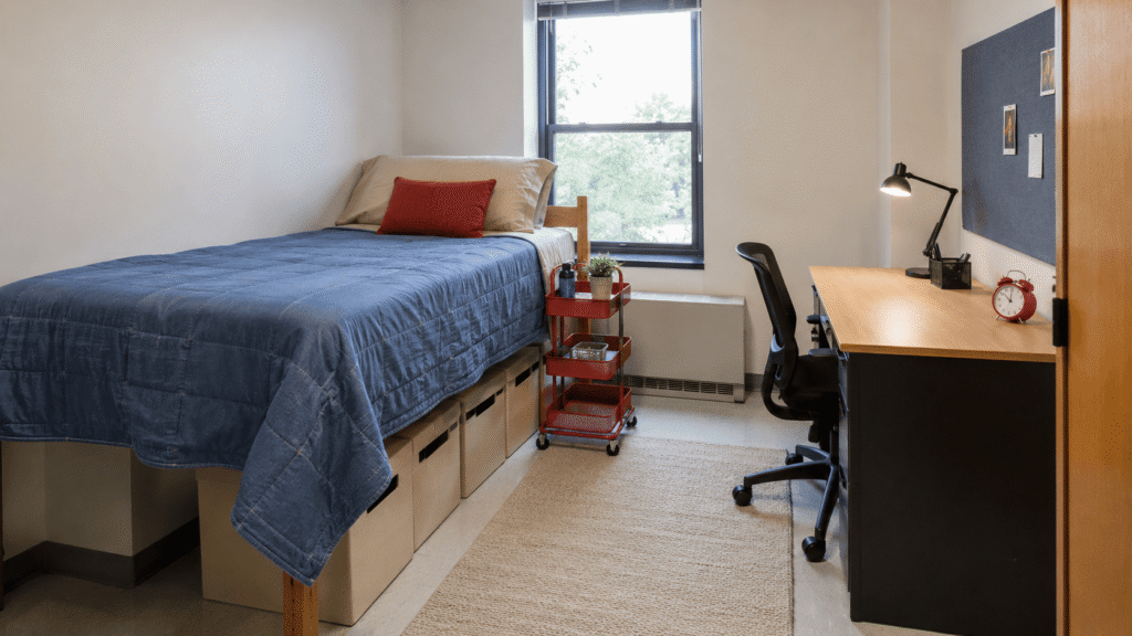
Faded denim blue and oatmeal create a durable foundation that can handle daily college life. Try a denim-look cotton quilt with oatmeal sheets, a canvas laundry bag, and simple cream curtains. Use tomato red for a rolling cart, alarm clock, or border around a fabric pinboard.
Denim hides minor wrinkles and everyday wear better than smooth dark bedding. The red should appear in two or three clear locations, not as a collection of tiny accessories. That controlled repetition gives the room a strong visual rhythm while leaving the desk and bed practical for actual use.
4. Lilac, Espresso, and Cool Silver
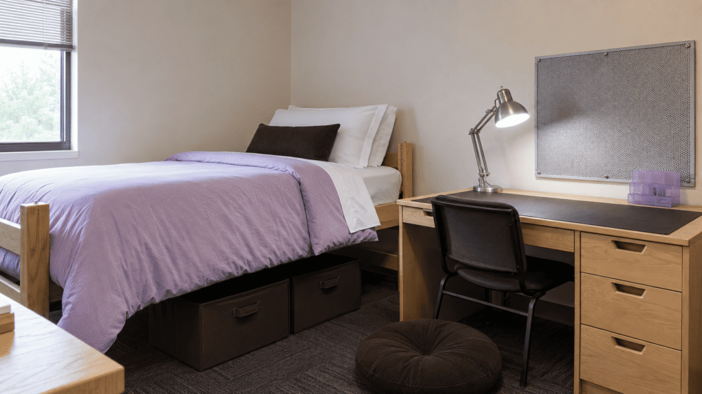
A pale lilac duvet can look washed out beside institutional beige, so give it weight with espresso brown. Use the brown on under-bed bins, a large desk mat, or a compact floor cushion. Add cool silver through a mesh memo board, task lamp, and metal hooks.
Dark brown makes lilac feel more mature, while silver keeps the scheme from looking overly soft. Look for brushed or polished metal rather than glittery finishes. If the room has cool fluorescent lighting, choose a lilac with a slight red undertone; blue-heavy lavender can turn noticeably gray after sunset.
5. Sage Green, Black, and Warm Birch
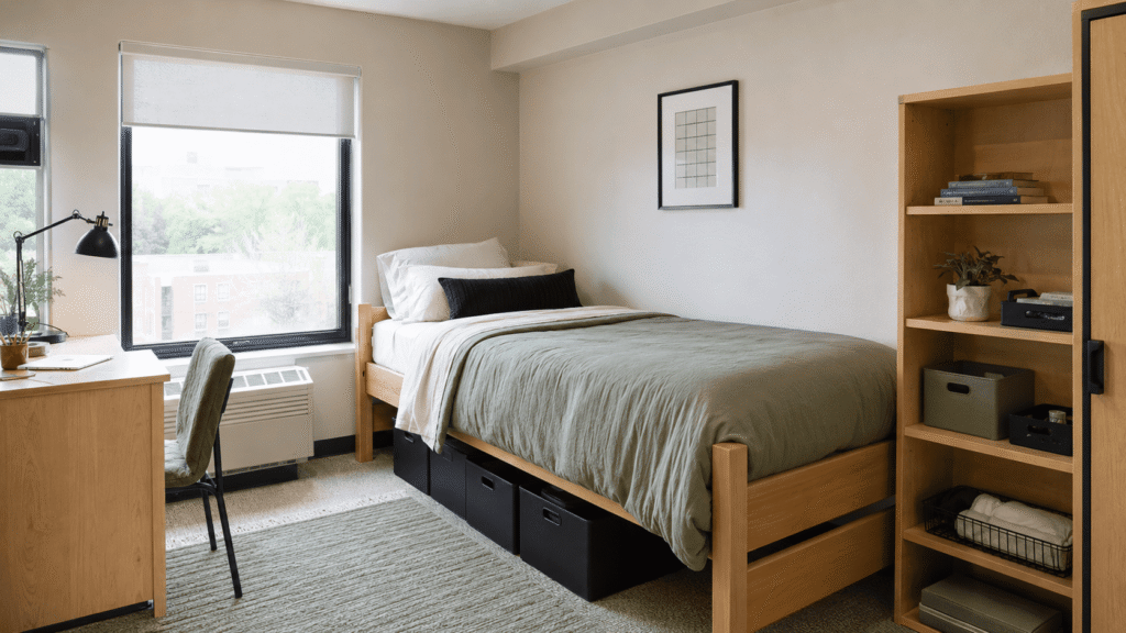
Instead of disguising college-issued birch or maple-look furniture, make its warm color part of the palette. Pair it with muted sage bedding and a removable sage desk-chair cover, then introduce matte black through a lamp, frames, and sturdy storage bins.
Black outlines the gentle green and gives the room a more graphic Gen Z look. Keep it below about 15% of the visible palette, especially in a dim dorm. Matching black labels on open storage can create order, but avoid covering a whole desk in black contact paper; it shows dust, fingerprints, and lifting seams quickly.
6. Dusty Pink, Olive, and Walnut Brown
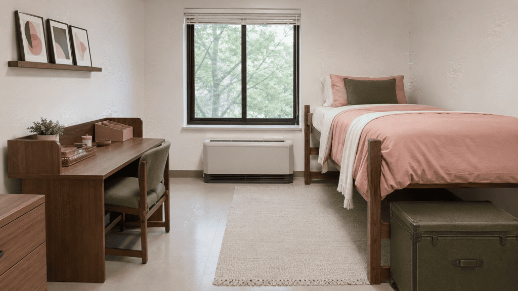
Choose dusty clay pink instead of a cool bubblegum shade. Use it on the bedding and one functional desk accessory, then bring in olive through a storage trunk, chair cushion, or small washable rug. Walnut frames and a wood tray add the darkest notes.
Olive reduces pink’s sweetness, and walnut gives inexpensive textiles a more collected appearance. Thrifted wood frames don’t need to match exactly, but their undertones should be similar. Hang them with approved removable strips and keep the overall composition within the width of the desk or bed below it.
7. Sky Blue, Tangerine, and Warm White
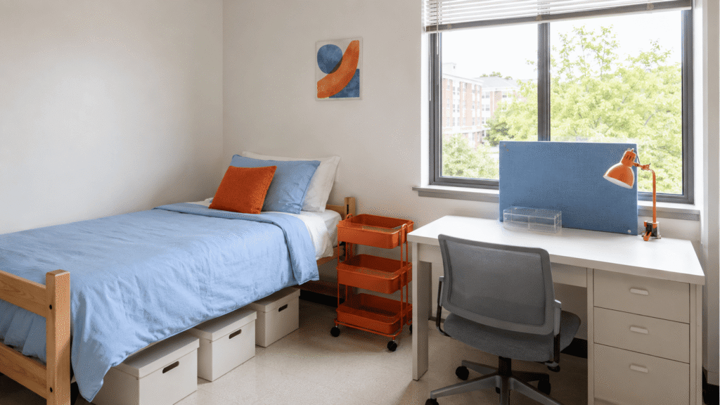
Sky blue can visually open a tight dorm, especially when it covers the bed and a fabric pinboard near the desk. Keep sheets, storage, and most of the wall warm white, then introduce tangerine through two high-impact objects such as a rolling cart and clamp lamp.
Orange and blue sit opposite each other on the color wheel, so even small amounts create noticeable contrast. Avoid spreading orange across ten tiny items. Two substantial accents will look calmer and more intentional. In a north-facing room, choose a slightly green-leaning sky blue so it doesn’t appear icy.
8. Forest Green, Cream, and Brass
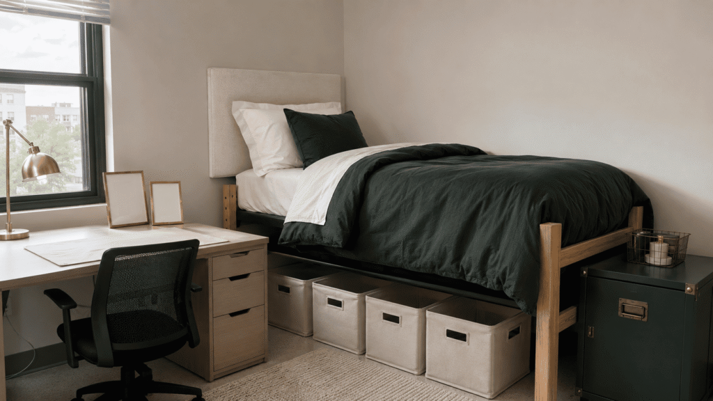
Concentrate forest green in one substantial area, such as a duvet or removable upholstered headboard. Surround it with cream sheets, curtains, and storage covers, then add warm metal through a brass-tone task lamp, hooks, or narrow frames.
This placement gives the bed depth without wrapping the entire room in a dark shade. Cream remains readable beneath cool overhead lights and softens the contrast with green. Select muted or aged-brass finishes rather than bright yellow gold. If you add a headboard, keep it slim and secure it with removable fasteners instead of drilling into the wall.
9. Periwinkle, Lime, and Charcoal
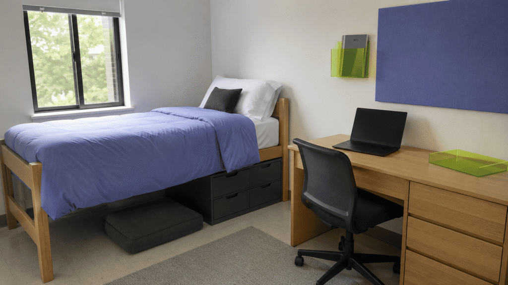
Periwinkle makes a calm base for sharper lime details. Use it on bedding or a large fabric memo board, then place lime on a translucent tray, wall pocket, or compact desk clock. Let charcoal appear through practical items such as the chair, electronics, power-strip box, and storage.
Including dark technology in the palette prevents laptops and monitors from looking like visual interruptions. Limit lime to about 10% of the scheme because it intensifies under cool LEDs. Transparent acrylic is useful here, but check the edges before buying; very thin molded plastic can crack when packed and moved between semesters.
10. Terracotta, Teal, and Parchment
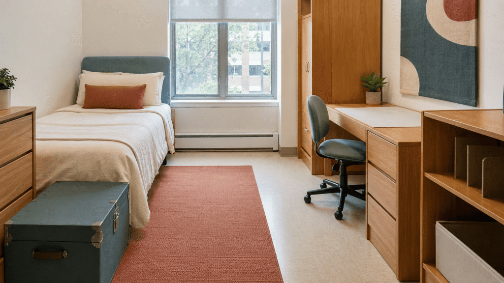
Parchment is a better bridge than stark white when the dorm has beige walls or warm laminate furniture. Start with parchment bedding, introduce terracotta through a low-pile rug or desk-chair cover, and use teal on a bedside trunk, storage cart, or single textile panel.
Terracotta and teal balance warm and cool color temperatures, so the room stays lively without becoming loud. Choose dusty versions of both colors rather than bright turquoise and orange. A flat-woven or low-pile rug is easier to vacuum and less likely to interfere with a rolling desk chair than a thick shag style.
11. Icy Blue, Mocha, and Pale Peach
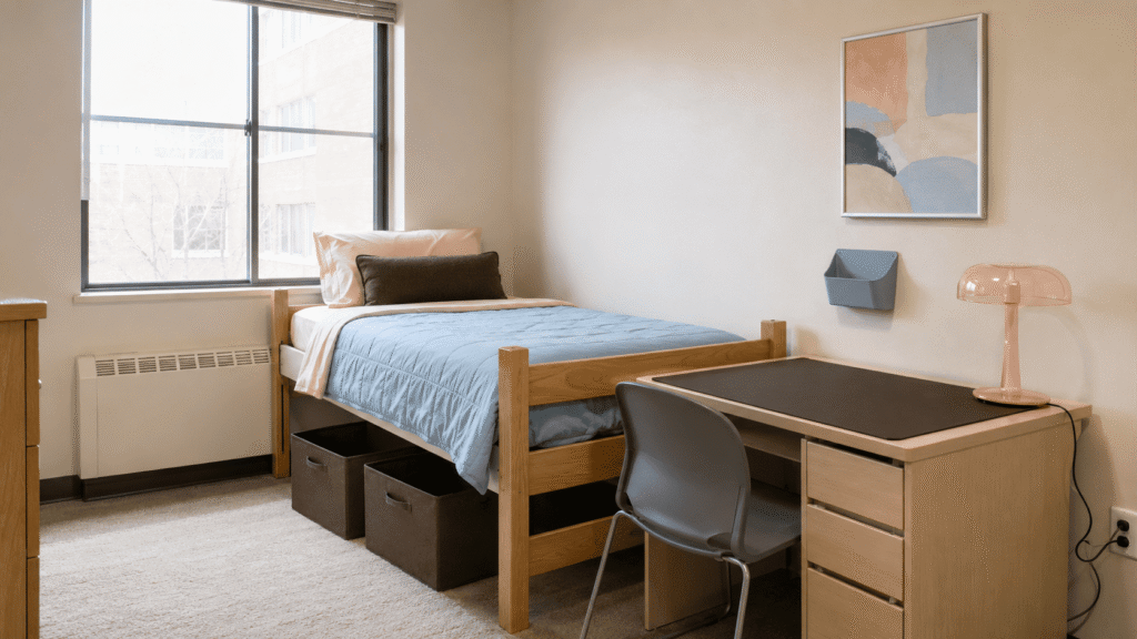
Place icy blue near the brightest part of the room through a quilt, curtain panel, or wall pocket. Use mocha for under-bed storage, the desk mat, and one larger frame. Pale peach works best as a restrained accent on a lamp, sheet set, or abstract print.
Mocha gives delicate pastels enough definition to survive flat fluorescent lighting. Peach also warms icy blue without creating an obvious split between “warm” and “cool” sides of the room. Test translucent peach lamps after dark; colored shades can cast an unflattering orange pool if the bulb is too warm.
12. Plum, Moss, and Mushroom
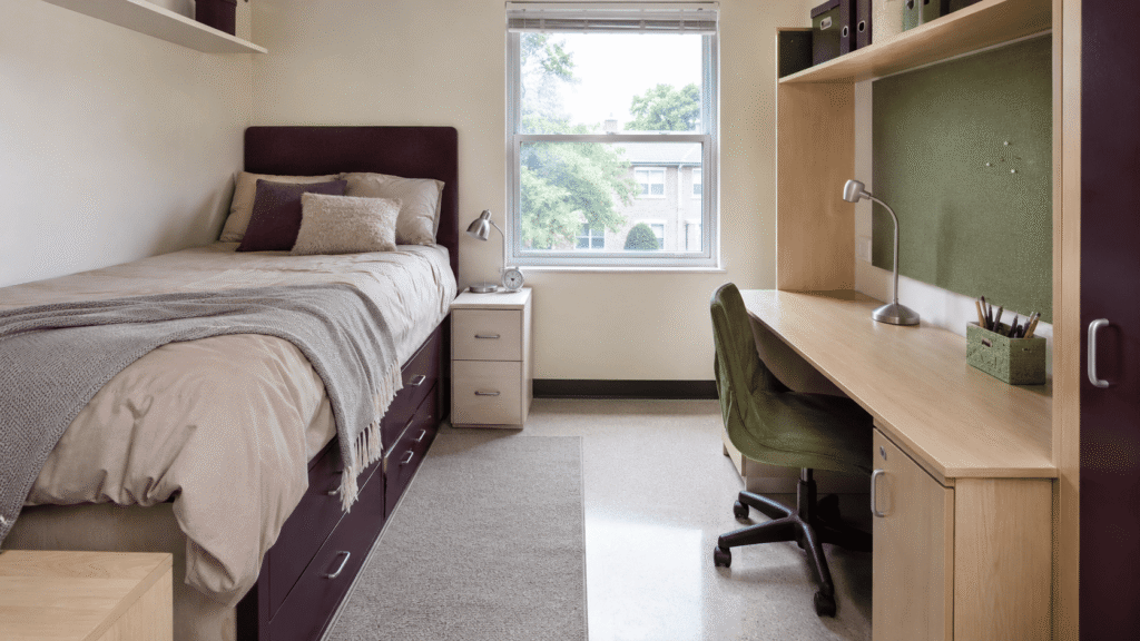
Use mushroom beige as the shared background, then assign plum and moss to separate functional zones. Plum can identify the sleeping area through a headboard panel, duvet, or under-bed storage. If you’re working with limited floor space, these small dorm room ideas can help you organize both zones without adding bulky furniture. Moss can define the study zone with a chair cover, fabric memo board, and pencil cup.
Color zoning is especially helpful in a single compact room because it creates order without adding furniture dividers. Keep the two dark shades similar in saturation so one doesn’t overpower the other. A mushroom base also connects the scheme to common beige walls and gray-beige dorm flooring.
13. Black, White, and Electric Blue
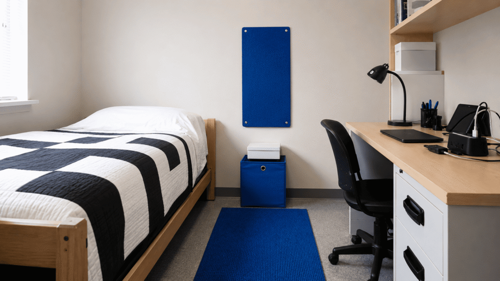
Begin with black-and-white bedding and practical white storage, but use electric blue as a continuous visual path instead of scattering it randomly. A blue bedside mat can connect to a removable storage cube and then rise to a fabric board mounted above it.
That vertical sequence pulls the eye upward and makes a low-ceilinged room feel more structured. Leave part of the wall bare so the contrast doesn’t become tiring. If the existing desk chair is black, include it in the composition rather than covering it; repeated black shapes will help organize cords, electronics, and other unavoidable dark objects.
14. Coral, Aqua, and Sand
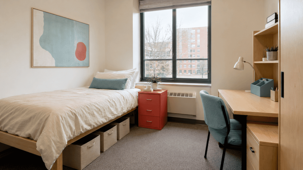
Ground coral and aqua with sandy beige to keep the combination relaxed rather than themed. Use sand on the largest surfaces, including bedding, a laundry hamper, and storage. Aqua can mark the study zone, while coral appears on one substantial bedside object and once more within nearby artwork.
Repeating coral only twice makes the room feel connected without filling it with matching accessories. Choose coral with a muted red undertone and aqua with a dusty finish. Bright tropical versions can fight with beige walls and make inexpensive plastic storage more visually prominent than you want.
15. Black Cherry, Slate Blue, and Soft Gray

For a darker palette, place the deepest shades below eye level. Use black cherry on the bed, slate blue for under-bed drawers and desk organizers, and soft gray on curtains or a removable wall textile. Keep upper walls and the area around the window mostly open.
Controlling the height of dark color gives the floor and furniture visual weight without making the ceiling feel lower. Black cherry can look flat in a poorly lit room, so include a neutral-white task lamp near the bed. Brushed silver works better here than brass because it reinforces slate blue’s cool undertone.
How to Choose Dorm Room Color Schemes
Begin with the finishes you can’t change: the walls, floor, blinds, desk, and bed frame. Photograph the empty room in daylight and under its overhead light if you can. A palette that looks balanced beside warm birch furniture may appear muddy next to cool gray laminate.
Use one dominant neutral, one main color, and one smaller accent as a starting formula. Bedding usually supplies the dominant controllable color because a twin XL duvet occupies so much of the room. Repeat the accent two or three times through useful pieces, then stop before every storage bin, frame, and cup begins matching.
Shared rooms need a little coordination, but both sides don’t have to be identical. Agree on one connecting neutral or finish—such as warm white, black, or chrome—then let each roommate use a different accent palette. This keeps the full room visually related while preserving individual style.