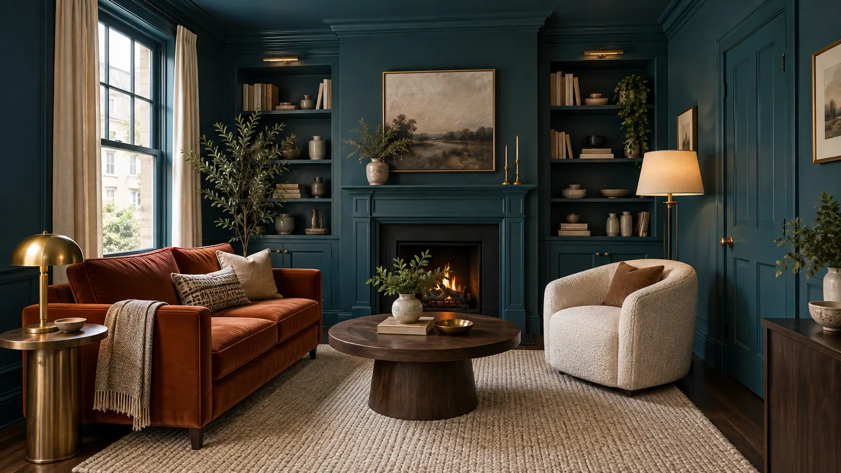
A small living room doesn’t have to rely on white walls to feel open and comfortable. Painting the walls, ceiling, trim, doors, and built-ins in one closely related palette can actually reduce visual breaks, helping a compact room look calmer and more intentional.
These 15 Color Drenching Living Room Ideas for a Bold Designer Look show how terracotta, olive, navy, plum, sage, and other rich shades can work in real homes. Each idea balances saturated paint with practical furniture scale, durable materials, useful lighting, and enough contrast to keep the room from feeling flat.
1. Wrap the Room in Earthy Terracotta
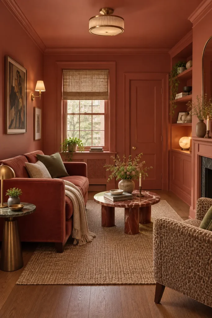
Paint the walls, ceiling, crown molding, window trim, and built-in shelves in the same muted terracotta. A rust-colored loveseat strengthens the enveloping effect, while an oatmeal rug and olive pillows prevent the room from becoming too orange.
Terracotta looks especially rich under warm 2700K bulbs and late-afternoon sunlight. Use a washable eggshell finish on walls and satin on doors and trim. The slight finish change defines the architecture without interrupting the color drenching. Add antique brass lamps and medium-tone wood rather than bright chrome, which can look too cool against the clay-toned background.
2. Try a Mustard-Ochre Living Room
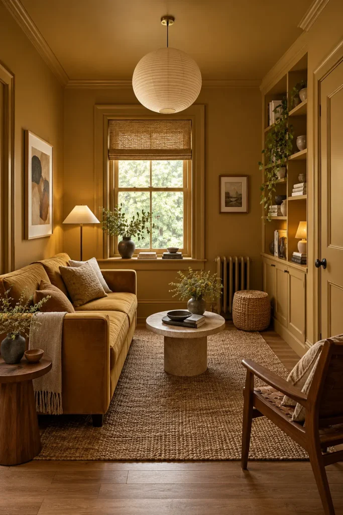
A deep mustard or ochre palette brings warmth to a small living room without relying on red undertones. Carry the color across the walls, ceiling, window casing, doors, and cabinetry, then choose a sofa in a slightly deeper golden-brown fabric.
Balance the saturated paint with a natural jute rug, cream cushions, and a pale stone coffee table. Since ochre can look dull in a poorly lit room, use more than one light source. A floor lamp beside the sofa and a small table lamp on a shelf create softer pools of illumination than a single bright ceiling fixture.
3. Create a Cocooning Olive Green Room

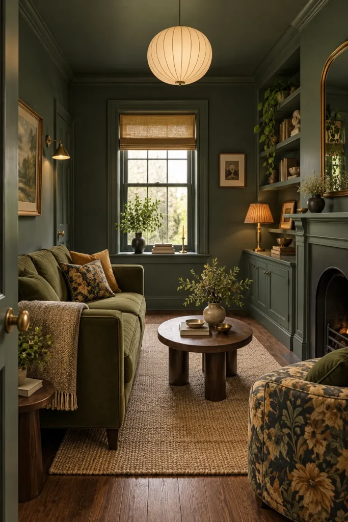
Deep olive paint gives a compact living room a quiet, grounded character. Apply it to the ceiling, fireplace surround, shelving, baseboards, and walls so the edges of the room visually recede. An olive velvet sofa can continue the palette, although textured performance fabric is easier to maintain in homes with children or pets.
Warm wood furniture, woven blinds, and aged brass keep the green from appearing cold. Choose artwork with cream mats and muted brown or ochre details. Leave roughly 16–18 inches between the sofa and coffee table so the narrow arrangement remains comfortable to use.
4. Use Mushroom Brown for Softer Color Drenching
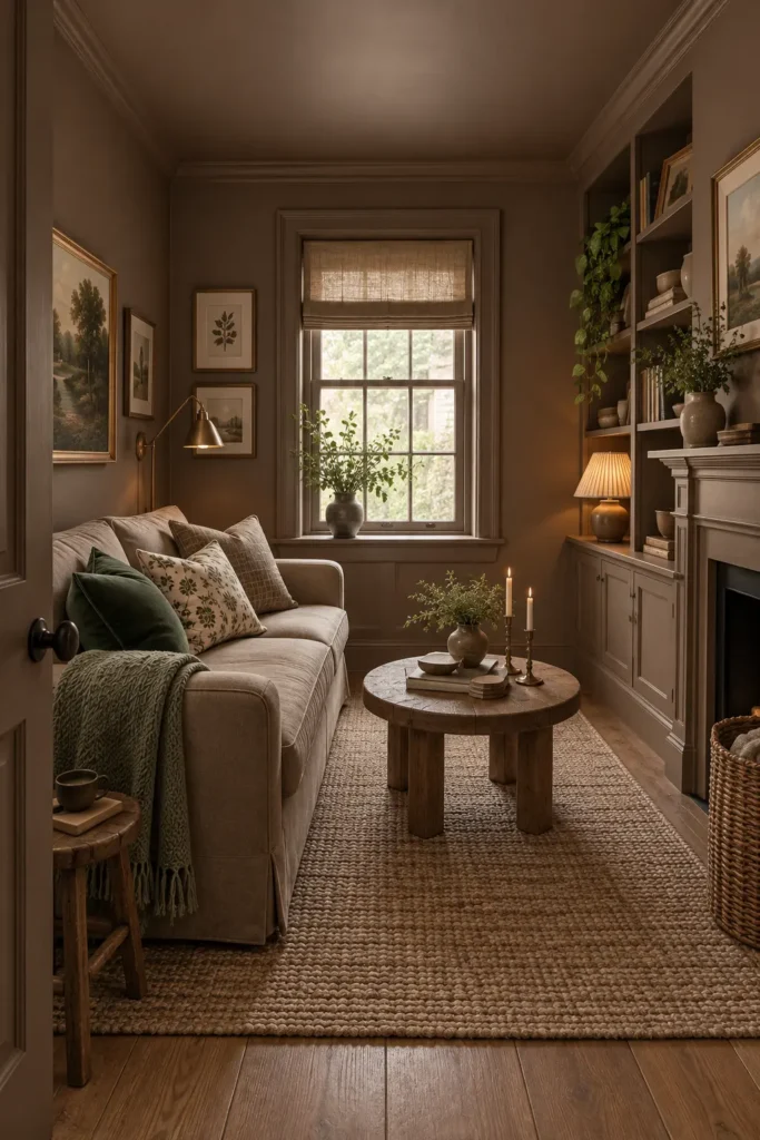
Mushroom brown is a useful option when you want a fully painted room without the intensity of a jewel tone. Look for a shade with warm taupe or cocoa undertones and repeat it across the walls, ceiling, trim, shelves, and fireplace.
A flax-colored sofa, rustic oak table, and olive throw add subtle contrast while maintaining the earthy palette. Test the paint on several walls before committing because taupe can turn gray, pink, or muddy as daylight changes. Matte wall paint disguises small imperfections, but use a tougher satin finish on shelves and frequently handled doors.
5. Choose Deep Plum for a Dramatic Retreat
Plum creates a sophisticated, cocoon-like living room when it covers every painted surface. Select a shade with brown or red undertones rather than a bright purple base. This keeps the result mature and easier to coordinate with wood, stone, and neutral upholstery.
A light beige sofa offers enough contrast to remain visible against the dark walls. Repeat plum through two or three pillows and a throw instead of buying matching purple furniture. Dark paint absorbs light, so include a floor lamp, wall sconce, and table lamp. Warm metallic details will also stop the room from looking flat after sunset.
6. Pair Moss Green Walls With Cream Seating
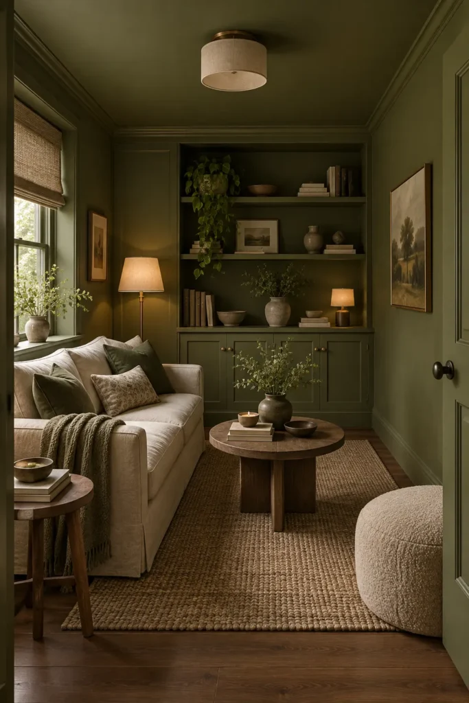
Moss green provides strong color without making a small living room feel overly formal. Paint the ceiling, walls, built-in cabinets, and doors in one matte moss shade, then place a compact cream sofa against the deepest wall.
The light upholstery becomes a clear focal point, while green pillows connect it to the room. Choose a tightly woven performance fabric if the sofa receives daily use; loosely woven cream linen can stain and snag more easily. A dark wood coffee table adds visual weight at floor level. Keep the tabletop around two-thirds the sofa’s length so it doesn’t overwhelm the available walking space.
7. Build a Tonal Burnt-Orange Schem
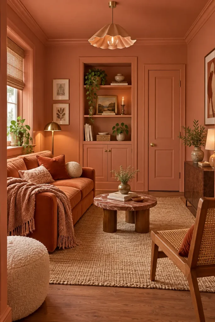
For a warmer and brighter interpretation, use burnt orange across the architecture and layer it with cinnamon, caramel, and soft peach. The slight variations keep the room dimensional while preserving the full color-drenched effect.
A cognac or rust sofa works well, but avoid filling every surface with the same exact orange. Cream boucle seating, natural oak, and a tan woven rug give the eye somewhere to rest. Burnt orange changes noticeably under artificial light, often appearing redder at night. Check your sample under both daylight and evening lamps before painting the ceiling and cabinetry.
8. Soften Olive Walls With Warm Neutrals
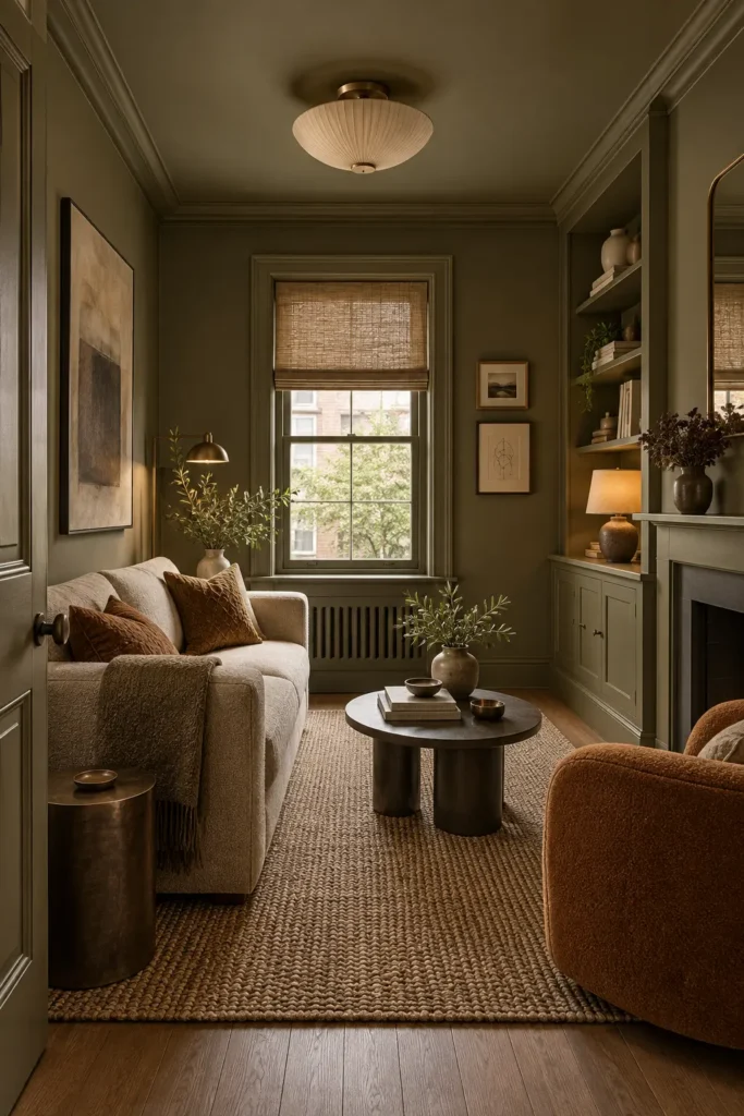
Muted olive can act almost like a neutral when it contains enough gray or brown. Continue the shade over walls, molding, ceiling, doors, and shelving, then introduce a warm white sofa and one caramel-colored chair.
The chair creates a useful visual anchor without breaking the room’s restrained mood. Choose a low-backed design so it doesn’t block the view across a narrow floor plan. A textured wool-look rug softens sound and makes the seating group feel connected. If real wool exceeds the budget, a dense polypropylene rug can be convincing, but avoid thin printed rugs whose pale edges quickly reveal their lower price.
9. Go Dark With Forest Green
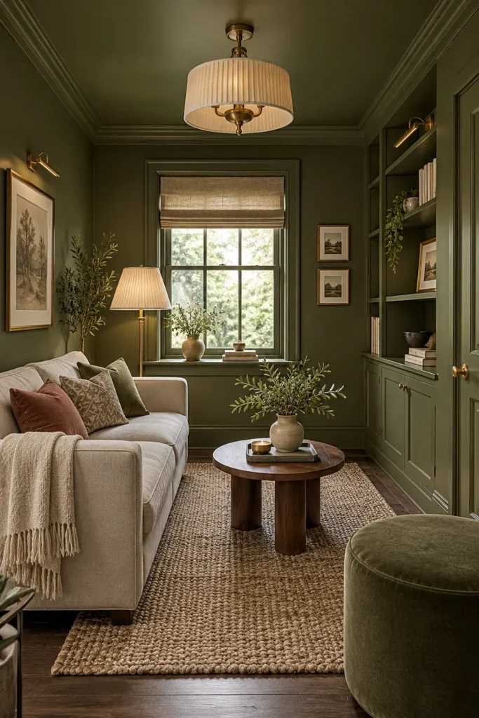
A dark forest-green living room can feel intimate rather than cramped when the layout remains simple. Paint the fireplace, bookcases, ceiling, walls, and window casing in the same shade. Keep the main sofa light and limit bulky furniture to one additional chair or ottoman.
The contrast between cream upholstery and deep green makes the seating easier to see, while olive cushions soften the transition. Use a mirror opposite or beside the window to redirect daylight, but don’t depend on reflection alone. Built-in shelf lighting and shaded lamps are necessary if you want the green to retain its depth in the evening.
10. Create a Moody Blue-Gray Sitting Room
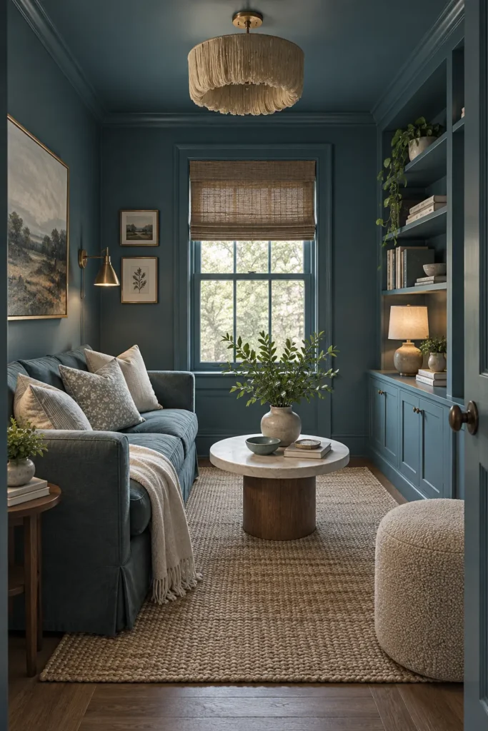
Blue-gray gives a small room the richness of navy with a slightly softer finish. Cover the ceiling, walls, fireplace, shelves, and trim, then use a sofa in the same color family. Cream pillows and a pale marble-topped coffee table will keep the center of the room from disappearing.
Select a blue with muted green or charcoal undertones for a refined result. Clear, cool LED bulbs can make blue paint appear sharp, so use warm-white bulbs instead. Brass lighting introduces warmth, while woven shades and medium-brown wood prevent the scheme from feeling like a formal showroom.
11. Layer Olive With Tobacco and Walnut
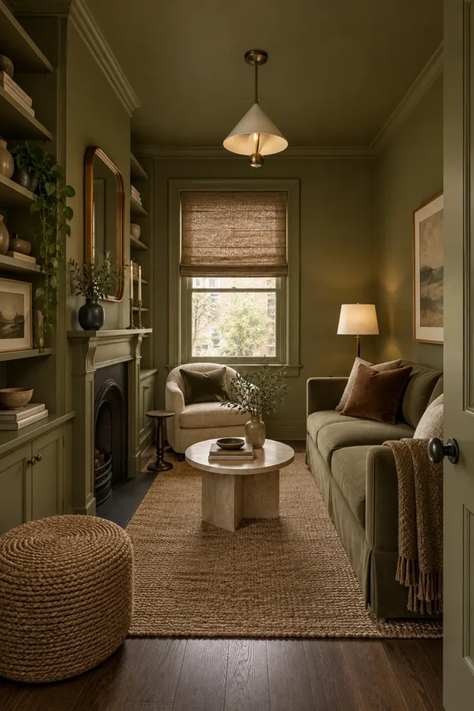
Olive paint takes on a more tailored character when it is paired with tobacco-colored upholstery and walnut furniture. Use one olive shade throughout the room, including the ceiling and built-ins, then add a curved rust or tobacco chair beside a light sofa.
The warmer accent gives the eye a destination and helps define the seating zone. Position the chair so it faces the sofa rather than turning entirely toward the television. Allow about 30–36 inches for the main walkway whenever possible. In a very narrow room, choose a chair with exposed legs because visible floor beneath furniture makes the layout feel less crowded.
12. Saturate the Room in Classic Navy
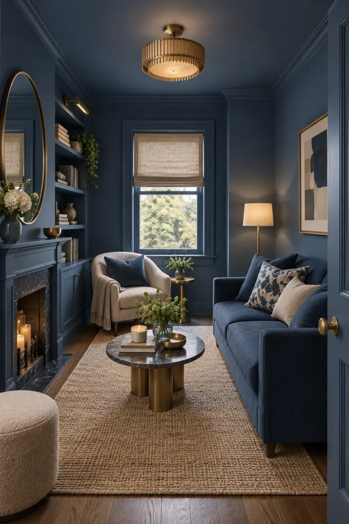
Navy color drenching can make ordinary trim and shelving look more architectural. Paint the walls, ceiling, doors, fireplace surround, and built-ins in the same inky blue, using satin paint on woodwork for a controlled change in sheen.
A navy sofa creates a seamless background, while an ivory armchair and natural rug provide contrast. Limit brighter accents to warm brass, muted artwork, and a few green plants. Navy shows dust more readily on horizontal surfaces, so built-in shelves and mantels require regular wiping. It also highlights uneven glossy walls, making a high-quality matte or low-sheen finish the safer choice.
13. Keep It Airy With Soft Sage Green
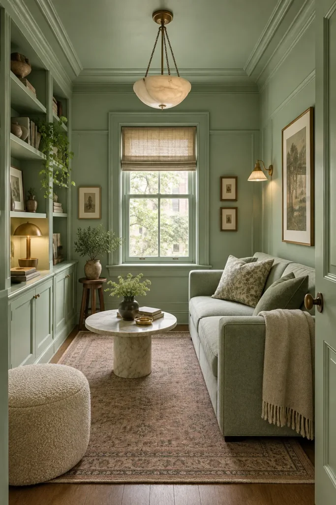
Color drenching doesn’t always need to be dark. A soft sage applied to the ceiling, walls, window trim, panel molding, and cabinets creates a gentle envelope while reflecting more daylight than olive or forest green.
Continue the palette with a gray-green sofa, then bring in an aged rug with faded clay details. Cream boucle and pale marble add brightness without introducing stark white. Sage can become chilly in north-facing rooms, so select a version with a yellow undertone. Brass lamps and warm 2700K bulbs will maintain that softness once natural light fades.
14. Use Dusty Rose as a Grown-Up Neutral
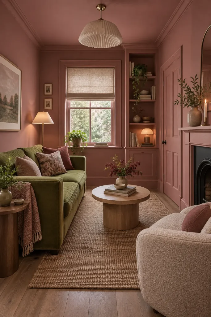
Dusty rose works best when it leans brown, clay, or mauve rather than sugary pink. Apply it throughout the room, including the ceiling, fireplace, built-ins, doors, and trim. An olive sofa creates a grounded complementary contrast, while burgundy cushions connect the furniture to the deeper red undertones in the paint.
Natural oak and oatmeal textiles keep the palette relaxed. Before painting, compare the sample beside your flooring because warm wood can intensify pink. In rentals, recreate part of the look with removable dusty-rose wallpaper on one uninterrupted wall and matching temporary fabric panels over open shelving.
15. Finish With Deep Teal Color Drenching
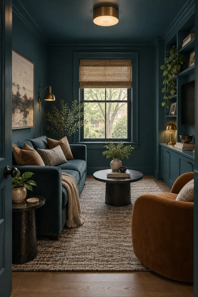
Deep teal sits between blue and green, making it easy to combine with warm wood, tan leather, black stone, and brass. Carry the shade from the walls onto the ceiling, trim, media cabinetry, and doors for a clean, uninterrupted shell.
A matching teal sofa visually recedes into the background, allowing a caramel chair to stand forward. This arrangement creates depth without requiring numerous accessories. If the room includes a television, painting the wall and surrounding cabinetry dark teal helps the black screen appear less dominant. Keep decorative objects sparse so shelves don’t become lost in small patches of visual clutter.
What to Consider Before Color Drenching a Small Living Room
Start by sampling the paint on the walls and ceiling rather than judging a small swatch under store lighting. Observe it in morning daylight, afternoon shade, and under your normal lamps. Dark shades usually need better layered lighting, while pale colors reveal inconsistent undertones more easily.
Color drenching also requires more preparation than a standard wall-painting project. Doors, trim, radiators, shelving, and ceilings may need different primers or paint finishes. Use matte or flat paint on ceilings, washable matte or eggshell on walls, and satin on woodwork. Matching the color across different sheens gives you a unified result without sacrificing durability.