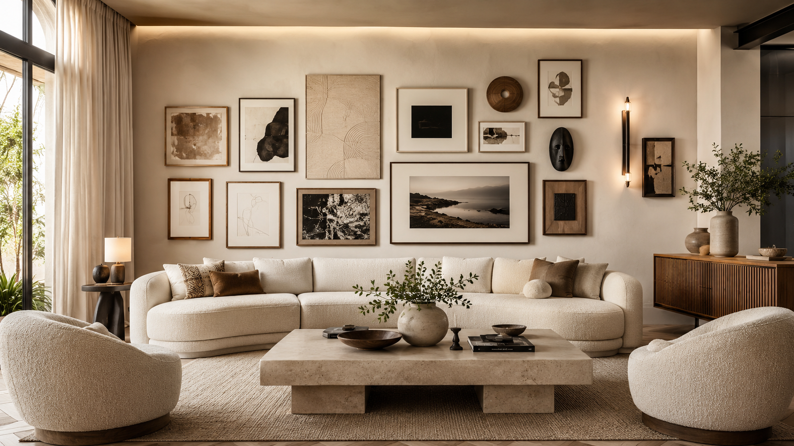
You’ve probably seen living rooms where the artwork feels scattered, too small, or squeezed onto one wall with no connection to the furniture below. The pieces may be beautiful on their own, but the overall composition never feels intentional.
A well-planned gallery wall layout changes that completely. The right arrangement creates a focal point, balances visual weight, and makes even affordable artwork look curated. These gallery wall layout ideas for living rooms go beyond basic grids and matching frames, giving you distinctive layouts that photograph beautifully and feel collected rather than copied.
1. Anchor Everything Around One Oversized Artwork
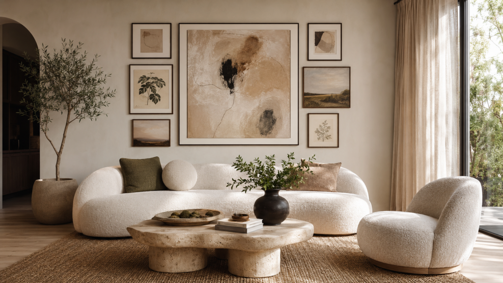
Instead of building your gallery from dozens of small frames, begin with one oversized canvas or framed artwork measuring roughly 36–48 inches wide. Hang its center about 57–60 inches from the floor, then arrange smaller pieces around it while leaving 2–3 inches between frames.
This instantly creates a focal point that prevents the wall from looking busy. The large artwork carries the visual weight, allowing the surrounding pieces to feel intentional instead of random. It’s one of the easiest ways to achieve a designer look without buying twenty matching frames.
2. Wrap the Gallery Around a Corner
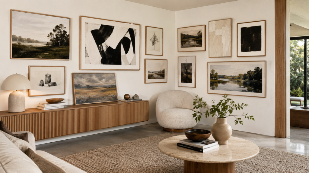
Most people stop their gallery wall at the edge of one wall. Instead, continue the composition around an inside corner so the artwork flows naturally into the next wall.
The effect feels architectural rather than decorative because it follows the room itself. Keep the largest pieces before the corner and gradually reduce frame sizes after the turn to maintain balance. This layout works especially well in open-concept living rooms where one seating area blends into another.
3. Float Frames on Long Picture Ledges
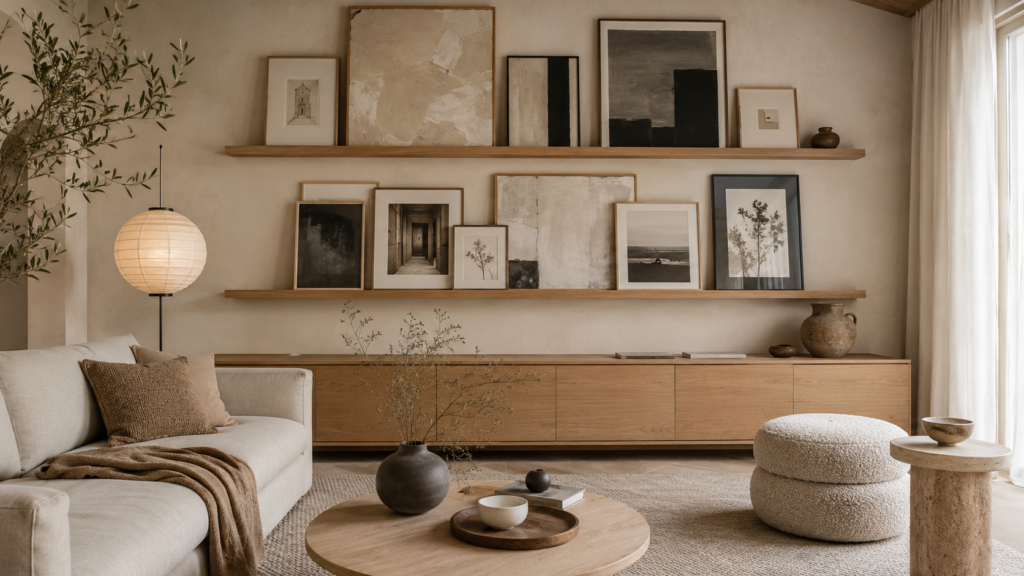
Skip permanent layouts and install two long picture ledges instead. Lean artwork in overlapping layers, mixing tall frames behind shorter ones while leaving small gaps so every piece remains visible.
Because nothing is fixed, swapping seasonal artwork or thrifted finds takes minutes instead of patching nail holes. Layering also adds natural depth that flat gallery walls often lack. Keep the deepest frame at the back and vary heights to avoid a straight skyline.
4. Break a Perfect Grid With One Panoramic Print
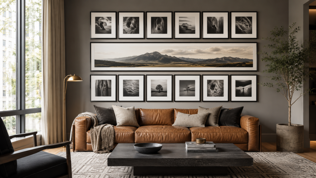
A strict grid can feel stiff. Create a clean matrix of identical frame sizes, then replace the center row with one panoramic landscape that spans the width of two or three frames.
That single interruption creates rhythm without making the arrangement feel messy. Your eye immediately lands on the larger artwork before exploring the surrounding pieces. It’s a subtle designer trick that keeps symmetrical layouts from feeling predictable.
5. Frame the Space Behind a Reading Chair
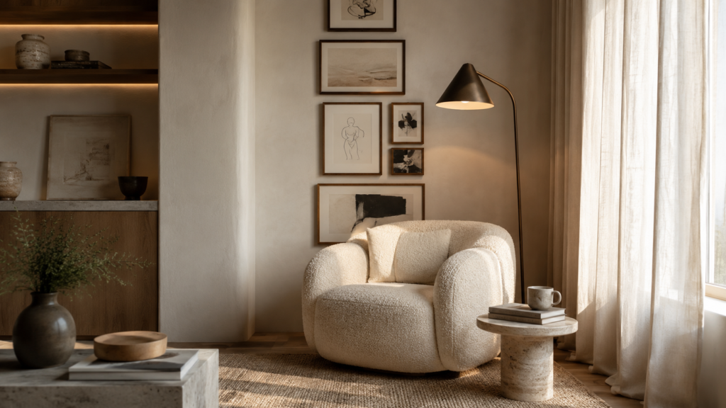
Gallery walls don’t always belong above the sofa. Turn an unused corner into a destination by placing a comfortable reading chair beneath a narrow vertical arrangement of artwork.
Stack five to eight frames from about 12 inches above the chair to near eye level, mixing sketches, abstract prints, and textured pieces. The vertical composition draws the eye upward, making the corner feel taller while giving the chair its own identity within the living room.
6. Let Negative Space Become the Design
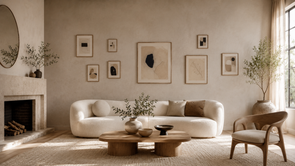
Instead of filling every inch, intentionally leave generous empty areas between clusters of artwork. Think of the blank wall as part of the composition rather than unused space.
This approach works beautifully on limewash, plaster, or softly textured walls because the finish becomes visible between frames. Negative space keeps large gallery walls feeling calm and expensive while allowing every artwork to breathe. It’s especially effective in minimalist and organic modern interiors.
7. Build Around a Floating Console Instead of a Sofa
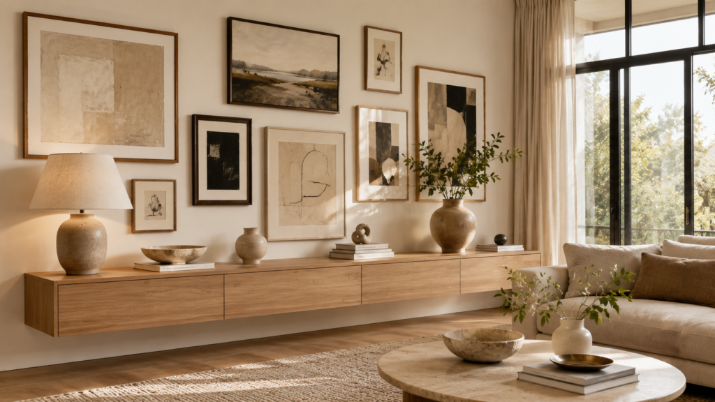
A slim floating console creates an unexpected anchor for a gallery wall. Position the console about 10–12 inches below the lowest frame and let the artwork extend beyond both ends of the furniture.
The furniture grounds the composition while decorative objects—ceramic vessels, books, and sculptural lamps—connect the wall to the room below. This layered approach creates far more depth than hanging artwork alone on an empty wall.
8. Mix Canvas, Shadow Boxes, and Textile Art
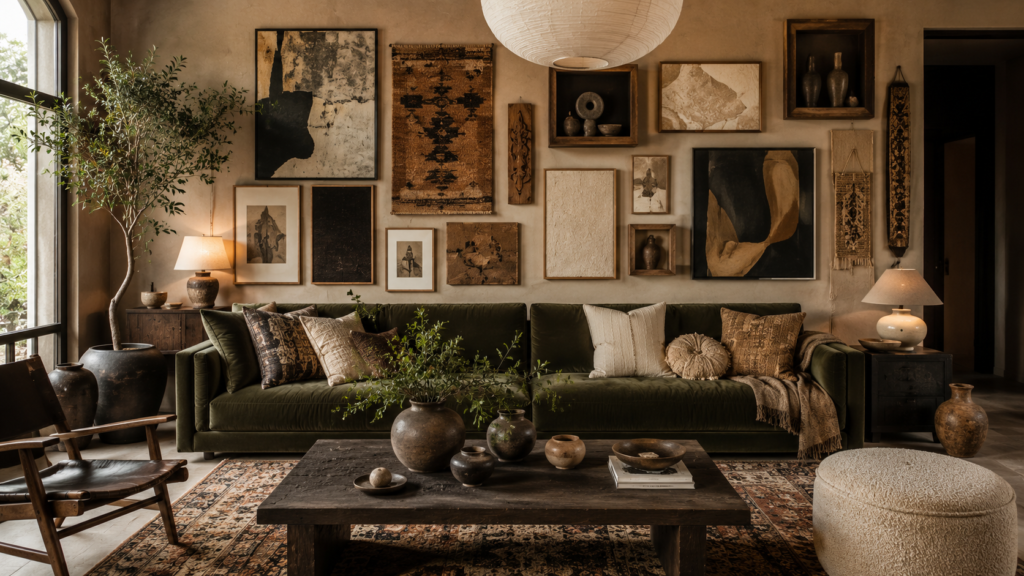
Every piece doesn’t need glass.
Combine framed artwork with linen-covered panels, shallow shadow boxes displaying collected objects, handwoven textiles, or carved wood pieces. Varying materials introduces texture before anyone notices the colors.
Keep the thickest objects near the center so the visual weight stays balanced. This mixed-media approach feels collected over time rather than purchased as one matching set, making it ideal for modern eclectic living rooms.
9. Create a Gallery That Climbs the Stair-Step Ceiling
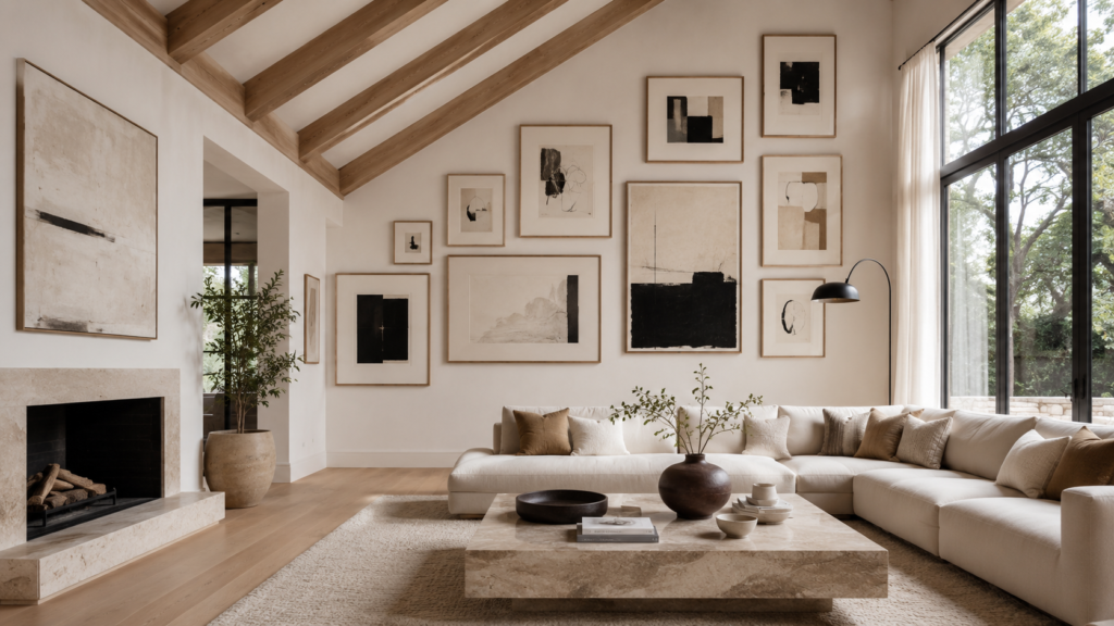
If your living room has vaulted or sloped ceilings, don’t force the artwork into a rectangle. Let the gallery gradually follow the roofline, increasing frame height as the ceiling rises.
The layout works with the architecture instead of fighting it, making the entire room feel more cohesive. Maintain consistent spacing of about 2–3 inches between frames so the changing heights still read as one intentional composition rather than scattered artwork.
10. Stretch the Gallery From Window to Window
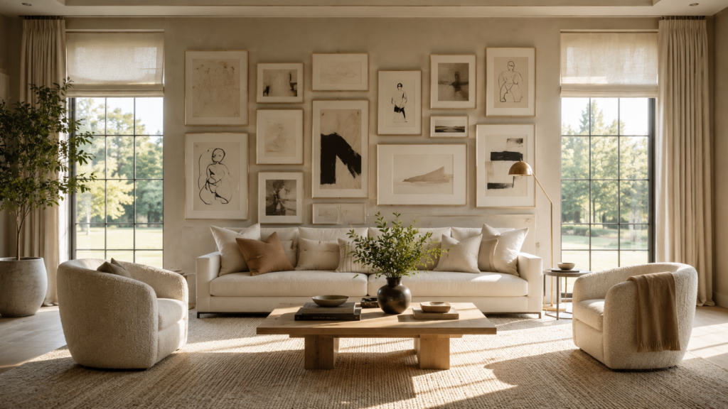
Instead of centering artwork only above the sofa, let the gallery span the full distance between two windows. Leave about 6–8 inches of breathing room from each window trim so the arrangement feels connected without crowding the architecture.
This wider composition visually enlarges the seating area and makes the entire wall feel custom designed. It works especially well in living rooms with long, uninterrupted walls where a small gallery would feel lost.
11. Build a Soft Arch With the Frame Heights
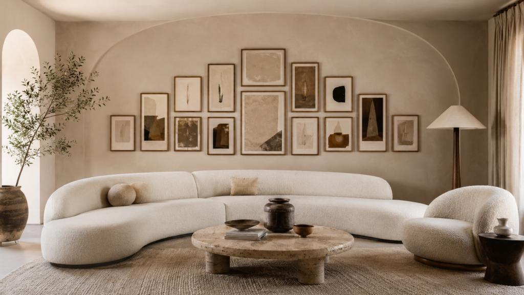
Forget perfectly straight top and bottom edges. Arrange the tallest artwork in the middle, then gradually reduce the height toward both sides until the entire gallery forms a gentle arch.
The curved outline softens boxy furniture and introduces movement without looking chaotic. It’s particularly beautiful in living rooms with curved sofas, rounded coffee tables, or arched doorways because the shapes naturally echo one another.
12. Pair Black Frames With Warm Walnut
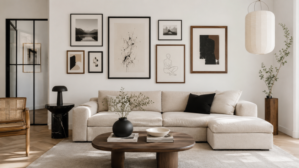
Matching frames can look flat. Instead, alternate slim black frames with medium-tone walnut frames while keeping the artwork itself within one color palette.
The contrast creates depth without becoming visually noisy. Black defines the layout, while walnut adds warmth that prevents the wall from feeling cold. Matte finishes work best because glossy frames often reflect too much light and distract from the artwork.
13. Let One Large Piece Overlap Smaller Frames
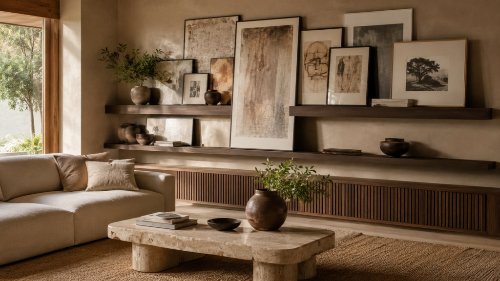
Instead of keeping every frame separate, allow one oversized artwork to slightly overlap the edge of one or two smaller pieces placed behind it on picture ledges.
This layered styling feels collected rather than carefully measured. Designers often use this technique because it mimics how art naturally accumulates over time. Keep the overlap subtle so every piece remains partially visible.
14. Turn an Empty Alcove Into a Mini Gallery
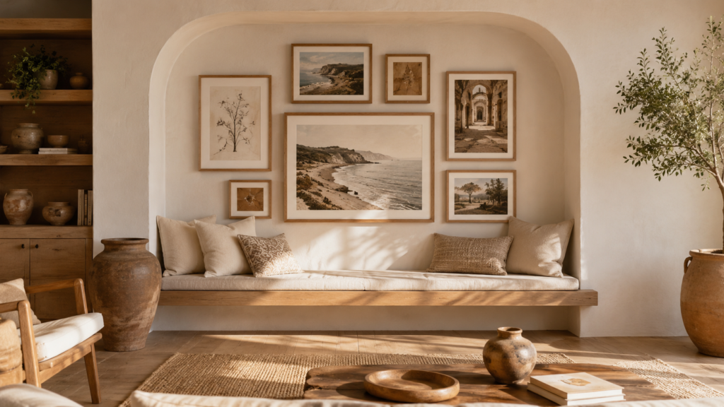
Small recessed walls often become forgotten spaces. Fill the entire alcove with a tightly planned gallery that fits the niche instead of treating it like a blank wall.
Because the architecture already frames the artwork, the arrangement instantly feels intentional. Use slightly smaller frames than you normally would so the composition doesn’t press against the surrounding trim.
15. Divide the Wall Into Three Connected Clusters
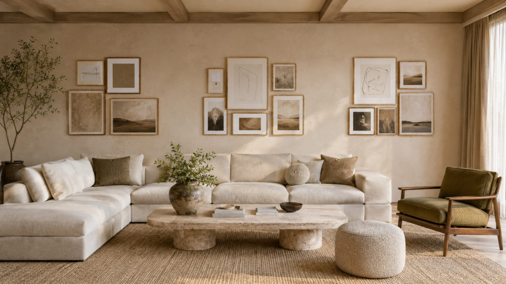
Rather than creating one massive gallery, build three separate groupings connected by consistent spacing and matching visual weight.
From across the room, your eye still reads one composition, but each cluster has room to breathe. This approach works especially well on long walls because it prevents the center from becoming overly dense while maintaining balance across the entire space.
16. Layer Tonal Art on a Limewash Wall
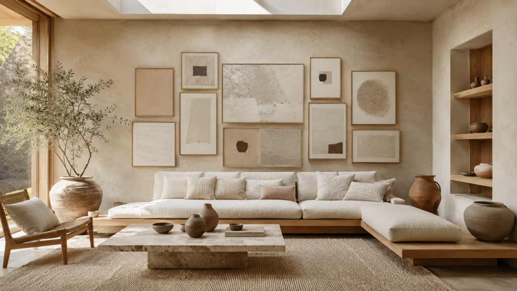
Choose artwork in soft creams, taupes, warm grays, clay, and muted browns against a limewash or subtly textured wall finish.
Instead of relying on bright colors, the beauty comes from texture, shadow, and tonal variation. Throughout the day, changing natural light creates gentle highlights across both the wall and artwork, giving the gallery far more depth than a flat painted background.
17. Create a Floor-to-Ceiling Collector’s Wall
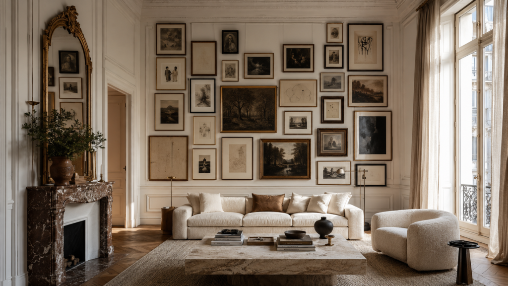
Let the gallery begin about 10–12 inches above a console or sofa and continue almost to the ceiling instead of stopping halfway up the wall.
The height makes standard ceilings feel taller while creating the impression of a curated art collection. Keep larger pieces near the lower third for stability and gradually introduce lighter, smaller works as the gallery rises.
18. Float Acrylic Frames Away From the Wall
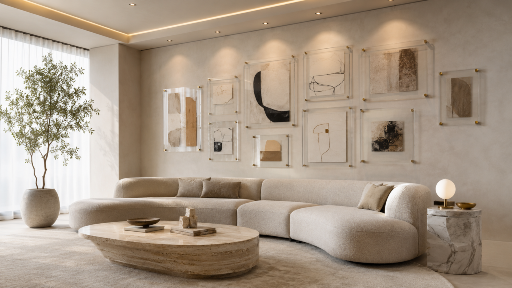
Replace traditional framed prints with acrylic panels mounted on brass or matte black standoffs that sit about an inch away from the wall.
The small shadow gap makes every artwork appear to float, adding a clean architectural detail that’s difficult to achieve with standard frames. This layout feels especially striking in modern and contemporary living rooms where simple lines are the focus.
19. Frame an Entire Sectional Instead of One Cushion
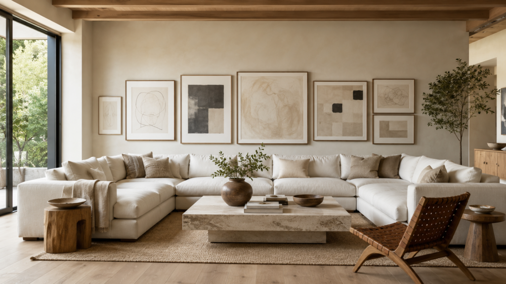
Large sectionals often make gallery walls look undersized because people only decorate the center seat. Instead, extend the layout so it covers about two-thirds to three-quarters of the sofa’s total width.
The wider composition feels proportional and prevents the furniture from overpowering the artwork. Leave roughly 8–10 inches between the sofa and the lowest frame so the wall still feels connected to the seating below.
20. Mix Vertical Columns With Horizontal Rows
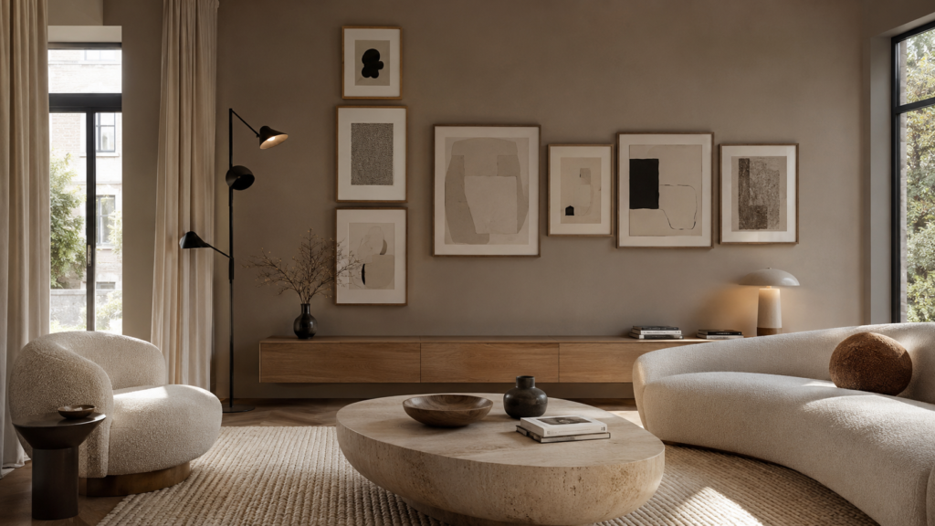
Combine one tall column of stacked artwork with a shorter horizontal grouping beside it instead of following one rigid shape.
The contrasting directions create movement across the wall while balancing different furniture heights. This layout works particularly well when one side of the room includes a floor lamp, tall plant, or bookcase that already introduces vertical emphasis.
21. Use Deep Mats Around Small Artwork
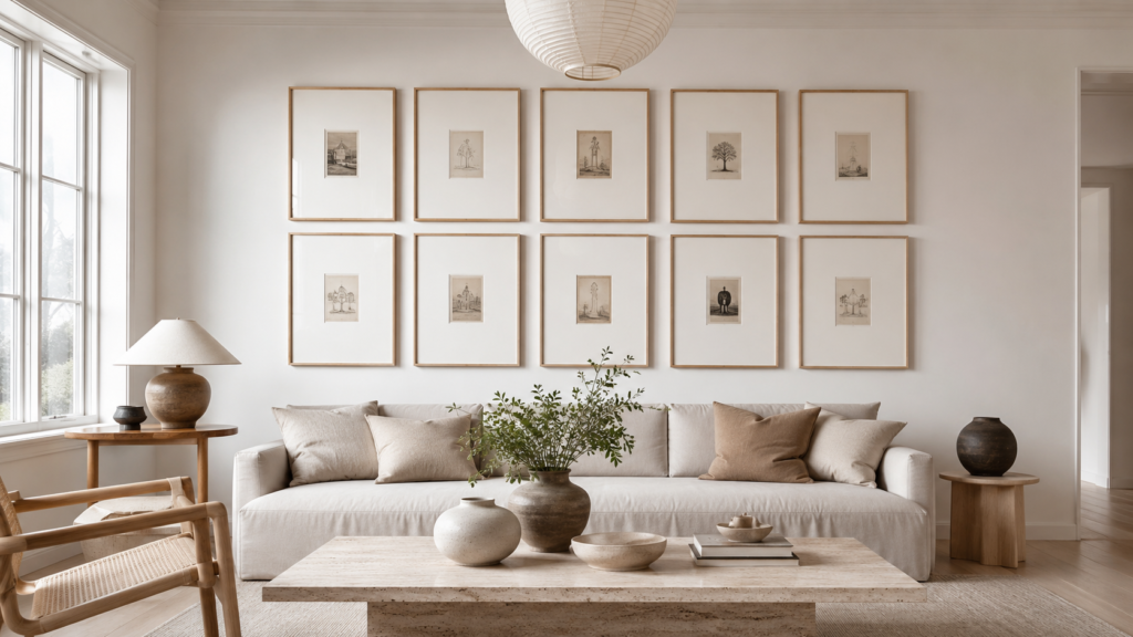
Small artwork doesn’t have to disappear on a large wall. Choose oversized mats—3 to 5 inches wide—inside larger frames so even tiny sketches or vintage prints gain presence.
The generous white space creates breathing room and gives inexpensive artwork a gallery-quality presentation. It’s also an excellent way to mix pieces of different sizes while maintaining a cohesive overall layout.
22. Build a Gallery Around a Sculptural Wall Sconce
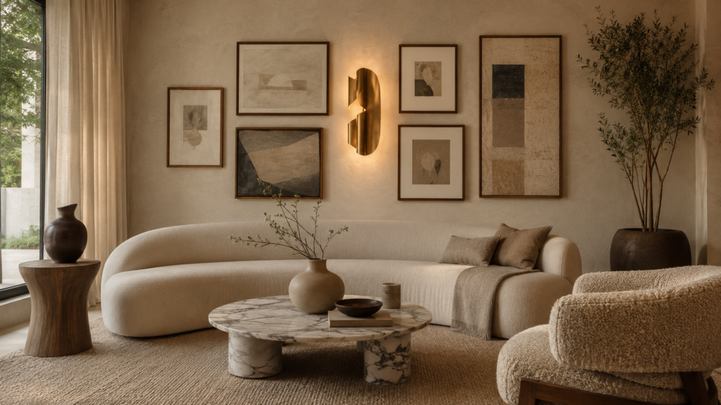
Instead of treating lighting and artwork separately, place a sculptural wall sconce near the center of the composition and arrange framed pieces around it.
The light becomes part of the gallery itself while adding evening atmosphere. Warm bulbs around 2700K produce a softer glow that flatters artwork, whereas cooler LEDs can make whites appear harsh and flatten subtle textures.
23. Balance Empty Space With One Leaning Floor Frame
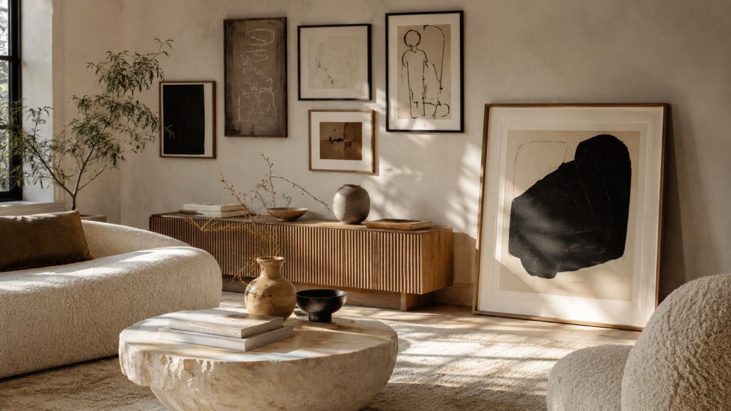
Not every piece has to hang. Lean one oversized framed artwork on the floor beside a media console or cabinet while hanging a smaller gallery above.
This combination introduces height variation and keeps the room from feeling too formal. It works especially well with oversized photography, abstract canvases, or vintage oil paintings that deserve a little breathing room.
24. Repeat One Accent Color Across Every Piece
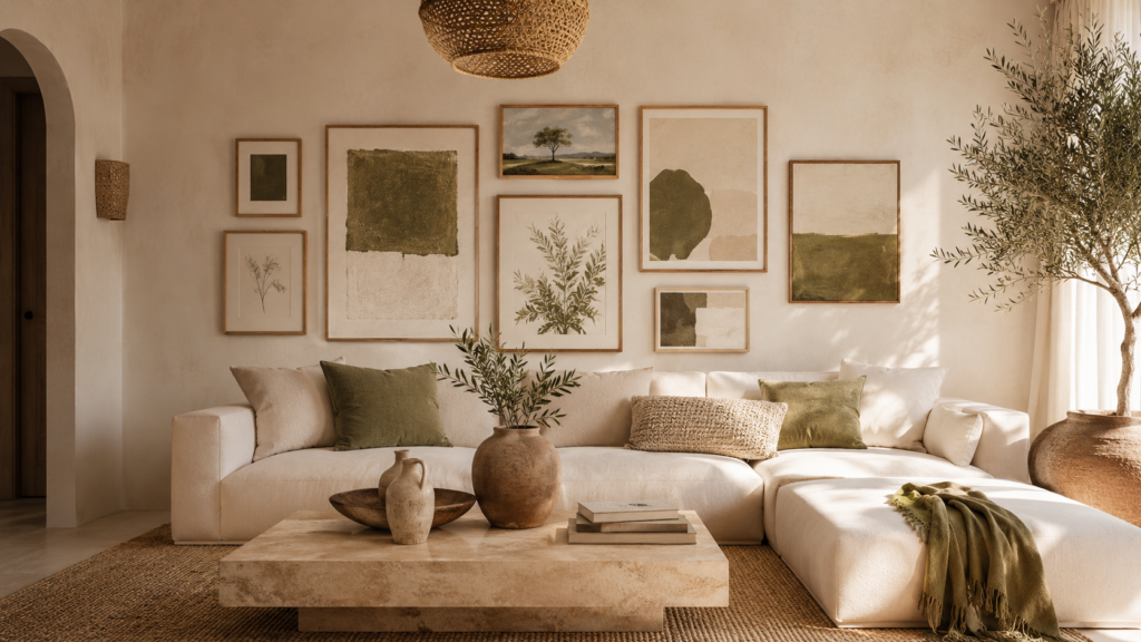
Instead of matching every frame, create unity by repeating one subtle accent color throughout the artwork—olive green, rust, muted blue, or warm terracotta all work beautifully.
The eye naturally connects the pieces through color, even when the subjects, frame materials, and sizes are completely different. This approach feels collected rather than purchased as a matching set.
25. Design the Gallery Like a Boutique Hotel Lobby
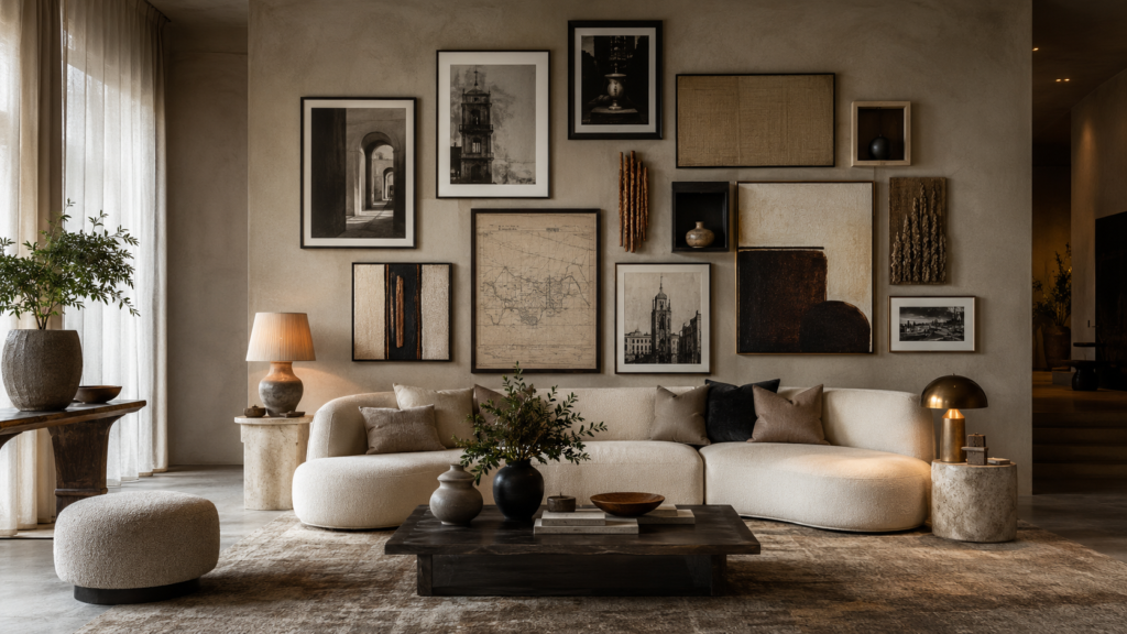
Think beyond family photos. Combine oversized abstract art, architectural sketches, vintage maps, sculptural wall objects, linen panels, and black-and-white photography into one carefully balanced composition.
Limit yourself to three frame finishes and one restrained color palette so the variety still feels curated. The result is layered, sophisticated, and timeless—the kind of living room wall people immediately notice because it feels professionally styled instead of copied from a catalog.