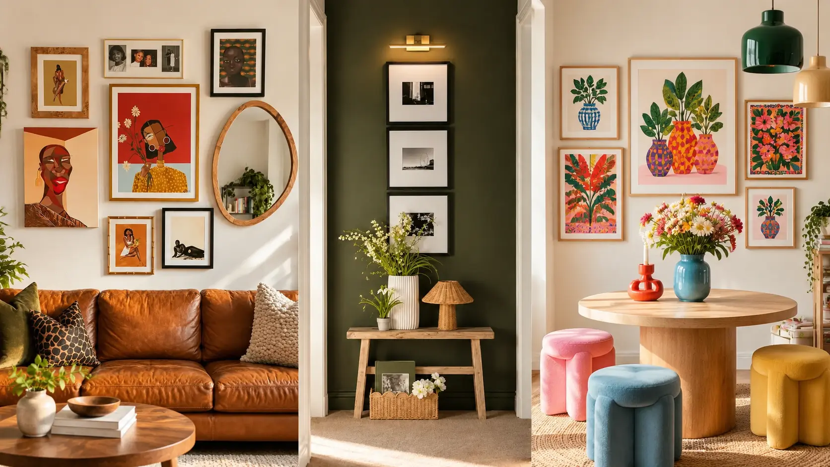
A gallery wall can look beautiful in a photo but feel surprisingly difficult to recreate at home. Frames end up too far apart, artwork looks too small above the sofa, or the colors don’t quite work together.
The best gallery wall ideas solve these problems through thoughtful placement, balanced proportions, and artwork that suits the room.
From a dramatic olive-green hallway to a cheerful botanical display, these 11 ideas show how different frame styles, colors, and layouts can work in real homes. You’ll find inspiration for living rooms, dining areas, staircases, and narrow hallways, along with practical tips for making each arrangement look intentional.
1. Minimal Black Frames
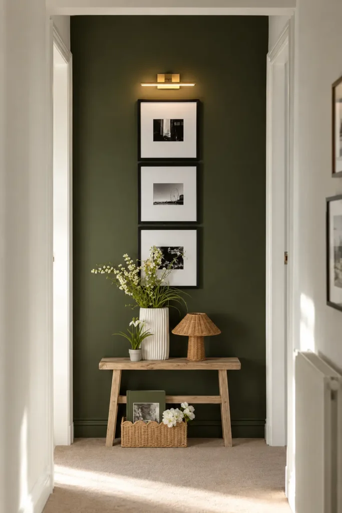
A narrow hallway doesn’t need a large collection of artwork to feel thoughtfully decorated. Three identical black frames, stacked vertically against a deep olive-green wall, can create a striking focal point without crowding the space.
Choose black-and-white photographs with wide white mats and slim matte-black frames. The white borders give each photograph room to stand out, while the dark wall makes the frames appear more defined.
Keep approximately 2–3 inches between the frames for a clean, consistent arrangement.
A slim brass picture light above the top frame adds a warm contrast to the olive paint. Below, a narrow natural-wood console with a ceramic vase and woven basket finishes the display.
This arrangement works particularly well between two doorways, where a wider gallery wall would feel cramped.
2. Bold Portrait Gallery
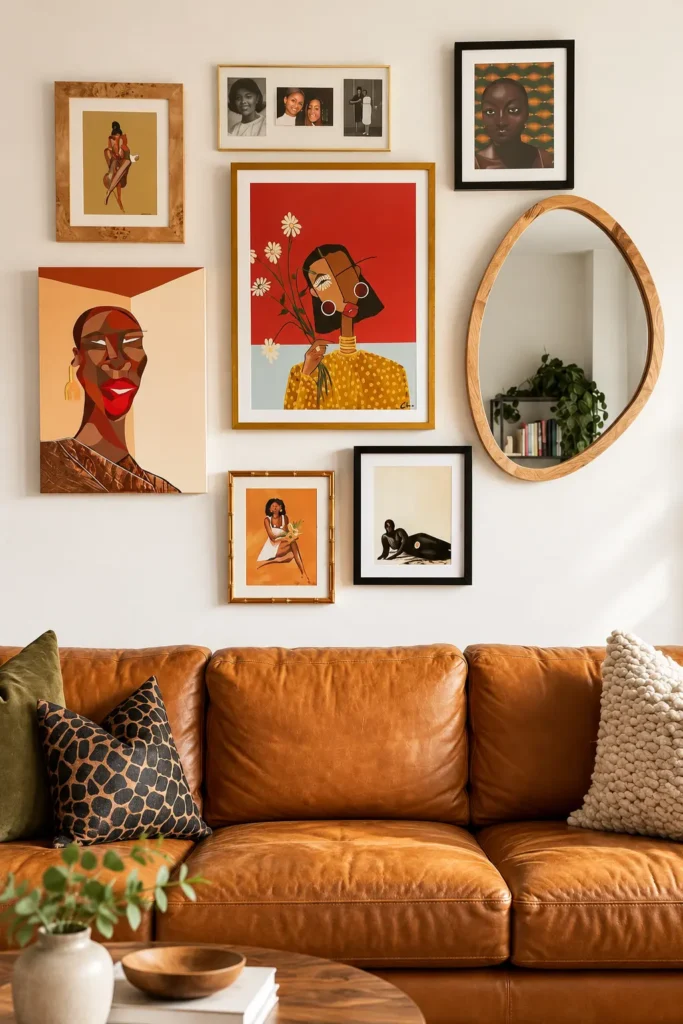
A gallery wall filled with colorful portraits can become the main feature of a living room, especially when paired with warm leather furniture.
Start with one large portrait in terracotta, red, or mustard yellow. Surround it with smaller illustrations, personal photographs, and artwork featuring similar earthy colors.
Mixing black, natural wood, and slim gold frames gives the collection a relaxed, collected appearance. An oval wooden mirror can also break up the rectangular shapes and reflect light into the room.
Above a sofa, aim for an overall gallery width of roughly two-thirds to three-quarters of the sofa’s width.
The rich artwork pairs beautifully with cognac leather, olive cushions, and wooden furniture. Keep the remaining wall decor simple so the portraits remain the focus.
3. Neutral Corner Gallery
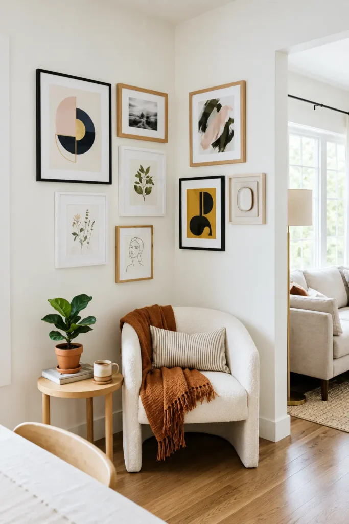
An unused corner can become a comfortable reading spot with a carefully arranged collection of neutral artwork.
Choose a mix of abstract shapes, botanical illustrations, black-and-white landscapes, and simple line drawings. Soft beige, muted olive, pale blush, and charcoal create enough variation without making the arrangement feel busy.
Instead of stopping the artwork at the corner, extend the display across both adjoining walls. This visually connects the surfaces and makes the corner feel like one designed area.
Combine light oak, white, and a few black frames to create subtle contrast.
A cream upholstered chair, rust-colored throw, and small wooden side table complete the setting. Leave enough space around the chair for comfortable movement, particularly near doorways.
4. Soft Pink Gallery Wall Ideas
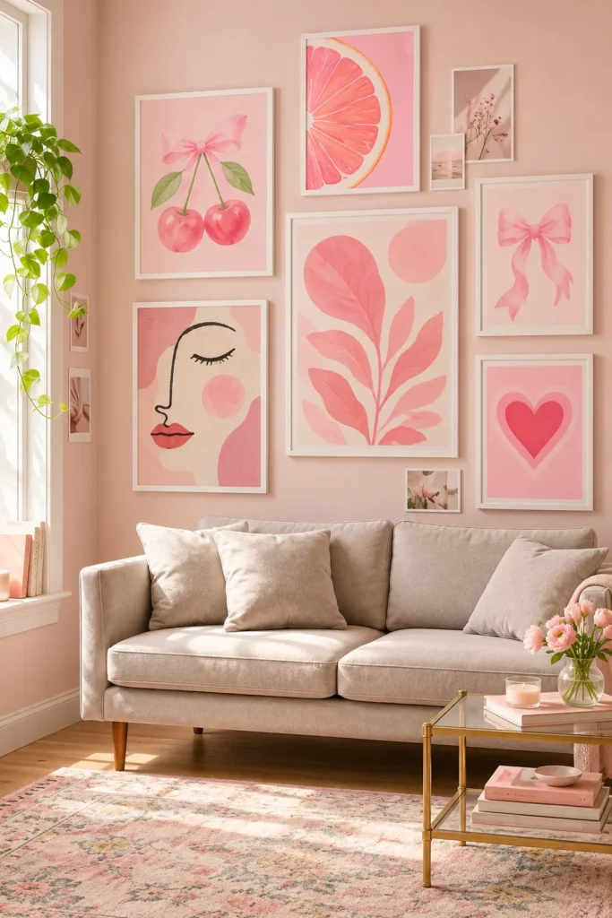
Pink gallery wall ideas work especially well when the artwork includes several shades rather than one flat color.
For a soft, feminine arrangement, combine watercolor cherries, delicate bows, floral illustrations, abstract leaves, and simple heart prints. Blush, dusty rose, peach, and muted coral give the display depth while maintaining a gentle palette.
White frames keep the arrangement light against pale pink walls. Position one larger botanical print near the center, then arrange smaller vertical and horizontal pieces around it.
A cream sofa, subtle floral rug, and gold-accented coffee table complement the artwork without introducing too many competing colors.
In a sunny room, choose prints with slightly muted tones, as intense pinks can appear much brighter in direct daylight.
5. Warm Eclectic Gallery
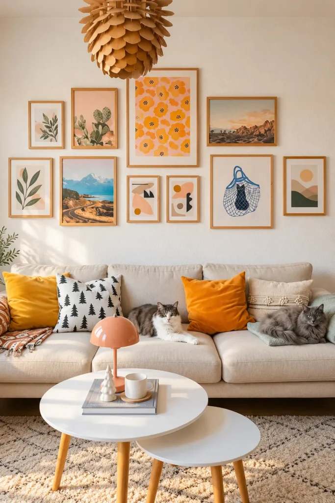
An eclectic gallery wall feels most successful when the artwork looks collected rather than purchased as one matching set.
Mix botanical illustrations, mountain landscapes, colorful floral prints, and simple abstract artwork. Look for pieces that share warm undertones, such as peach, mustard, sage, and sandy beige.
Natural oak frames are an easy way to connect different subjects. They also pair well with cream upholstery, woven rugs, and warm wooden furniture.
Try placing one larger floral print toward the upper center and arranging smaller pieces at different heights around it. Keep the outer edges loosely balanced rather than forcing every frame into a grid.
Secondhand frames are particularly useful for this style. A consistent wood stain can make inexpensive mismatched frames look like part of the same collection.
6. Japanese-Inspired Art
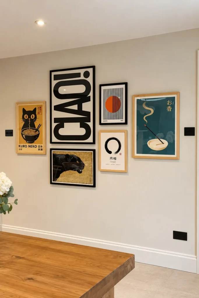
Japanese-inspired graphic artwork can create a bold gallery wall without relying on bright colors throughout the room.
Combine oversized typography, geometric prints, traditional-inspired illustrations, and simple nature motifs. Black, cream, mustard yellow, and deep teal create a distinctive palette that works beautifully against warm white walls.
Use one large typographic print as the visual anchor. Surround it with smaller artwork featuring a limited number of colors and different proportions.
Slim black frames emphasize the graphic designs, while pale wooden frames prevent the collection from feeling too heavy.
This arrangement suits a dining room or home office with simple furniture and uncluttered surfaces.
When purchasing artwork featuring Japanese writing, check that the characters are accurate and meaningful rather than decorative text added without context.
7. Colorful Entryway Gallery
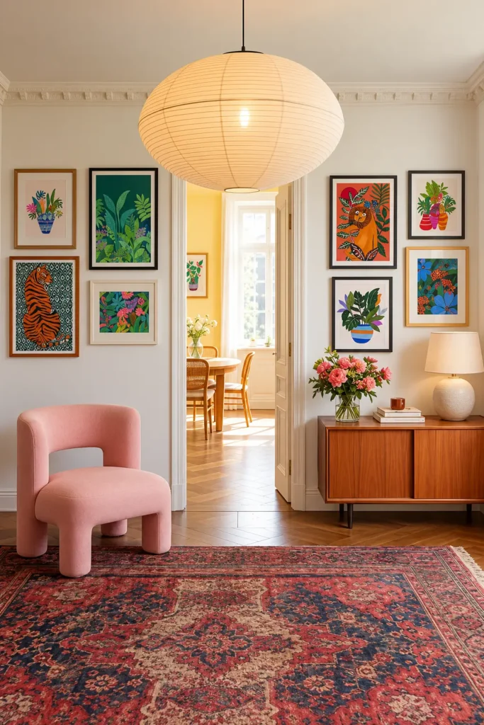
An entryway gallery wall gives visitors something interesting to notice before they even reach the living room.
Choose bright botanical illustrations, playful animal artwork, and colorful prints featuring deep green, coral, orange, and blue. These colors look particularly fresh against warm white walls.
If your entryway has a central doorway, consider arranging artwork on both sides instead of concentrating everything in one area. This creates visual balance while keeping the passage open.
A wooden sideboard, pink accent chair, and patterned rug can repeat colors from the artwork.
For narrow entrances, avoid placing furniture where it interrupts the walking path. Wall-mounted art provides decoration without using valuable floor space, making it a practical choice for smaller homes.
8. Bright Botanical Prints
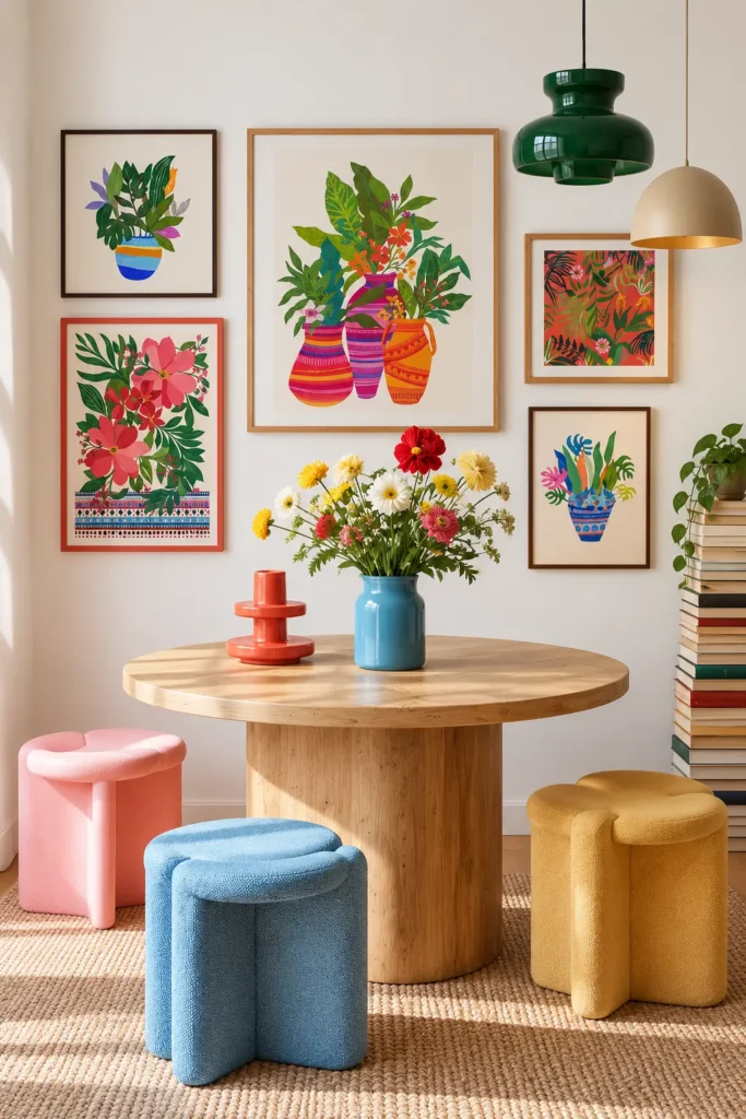
Botanical artwork doesn’t have to mean traditional green leaves and muted flower paintings.
For a cheerful dining corner, choose illustrations featuring oversized tropical foliage, colorful vases, bold flowers, and patterned backgrounds. Look for prints combining emerald green, coral, pink, orange, and bright blue.
A large central botanical print creates a natural focal point. Four smaller pieces arranged around it provide variety without overwhelming the wall.
Keep most frames in light wood, then introduce one contrasting colored frame if the room needs another accent.
Below the gallery, a round oak table and upholstered stools in complementary colors make the artwork feel connected to the furniture.
Real flowers in a blue ceramic vase can repeat the shapes and colors of the prints, creating a coordinated arrangement that still feels relaxed.
9. Family Photo Wall
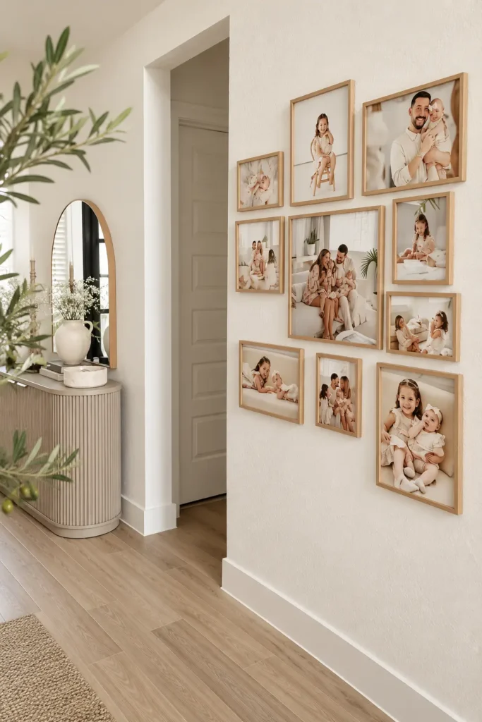
A family photo gallery can make a hallway feel personal while keeping the decoration simple and organized.
Choose photographs from different moments rather than displaying only formal portraits. A mixture of family gatherings, candid pictures, and individual photographs makes the collection more interesting.
Matching light-oak frames help unify images taken in different locations and lighting conditions. For a cohesive result, use similar photo editing and consistent mat widths.
Arrange the largest photograph near the center, with smaller portrait and landscape frames around it.
In a busy hallway, use frames with acrylic glazing instead of glass where accidental bumps are a concern. Acrylic is lighter and less likely to shatter.
A nearby console table and mirror can complete the area without distracting from the photographs.
10. Playful Staircase Gallery
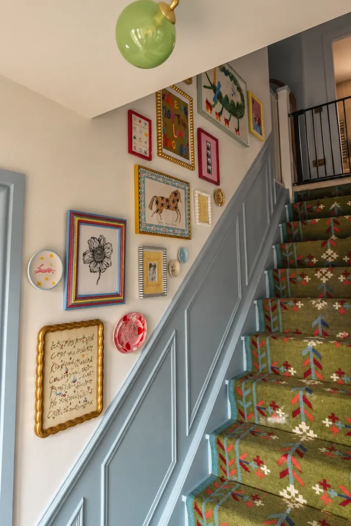
A staircase offers an opportunity to create a gallery wall that follows the architecture instead of sitting in a traditional rectangle.
Combine colorful picture frames, illustrated prints, small decorative plates, and artwork with unusual shapes. Red, blue, yellow, and gold accents can create a cheerful contrast against white walls.
Arrange the pieces in a loose diagonal that follows the angle of the stairs. Keep the main visual line roughly parallel to the handrail, with smaller artwork filling selected gaps.
Use paper templates to test the arrangement before drilling. Staircases are harder to measure and reach than ordinary walls, so planning saves unnecessary holes.
Secure every piece with suitable hardware, particularly near the handrail. Avoid decorations that project far enough from the wall to catch clothing or bags.
11. Elegant Dining Gallery
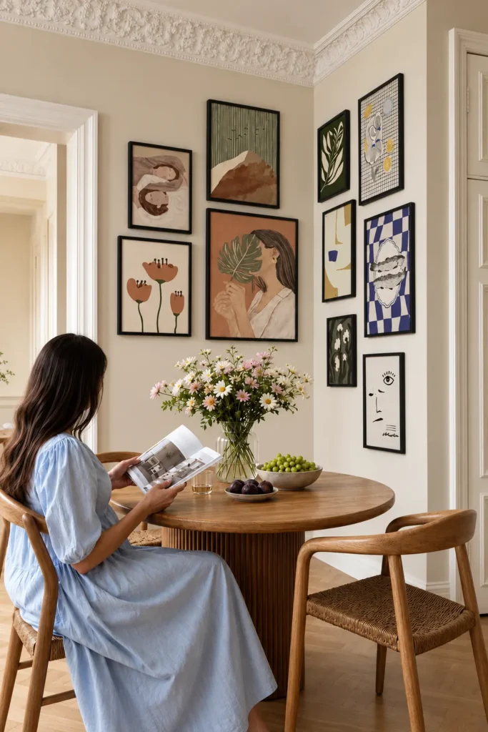
A dining room gallery wall can feel polished without using identical artwork or expensive frames.
Combine abstract portraits, botanical illustrations, minimalist line drawings, and soft geometric prints. Choose a restrained palette of terracotta, olive, cream, muted blue, and warm brown.
Slim black frames create definition against beige walls and work particularly well with natural wooden dining furniture.
If the table sits near a corner, extend the arrangement onto the adjoining wall. This makes the dining area feel visually connected rather than concentrating all the decoration on one surface.
Hang the lower frames high enough to avoid contact with chair backs. In a compact dining nook, check the clearance when chairs are pulled out.
A simple vase of flowers can echo the artwork without making the tabletop feel overcrowded.
What to Consider Before Hanging Your Art
Even beautiful artwork can look awkward when the spacing or proportions are wrong. A little planning helps your gallery wall feel connected to the room.
For a gallery displayed on an open wall, aim to place the visual center around 57–60 inches above the floor. Above a sofa or console, the furniture becomes part of the composition, so the artwork usually needs to sit lower.
A gap of approximately 6–8 inches between the bottom of the gallery and the top of a sofa is often a useful starting point.
Frame spacing also changes the finished look. Gaps of around 2–3 inches create a tighter arrangement, while larger gaps give individual pieces more attention.
Before hanging, trace each frame onto paper and tape the templates to the wall. Check the arrangement from the doorway and from your usual seated position.
For renters, removable picture-hanging strips may work for lightweight frames on compatible surfaces. Follow the manufacturer’s weight limits and removal instructions, and remember that even removable products can damage certain paint finishes.
Budget-Friendly Gallery Wall Tips
A beautiful gallery wall doesn’t require expensive original artwork or custom framing.
Thrift stores, flea markets, and secondhand marketplaces are useful places to find wooden frames. Look for solid corners and sturdy backing rather than focusing only on the existing finish.
Printable artwork can also be affordable, but paper quality matters. Heavyweight matte paper generally looks more refined than thin, glossy printer paper, especially behind glass.
For larger prints, compare local print-shop prices with online printing services before ordering.
If you already own frames in several colors, painting them in one or two coordinated finishes can make the collection feel more consistent.
Spend a little more on secure hanging hardware and properly sized mats. These details often make a greater visual difference than buying expensive artwork.